library(tidyverse)
library(here)
library(janitor)
library(RColorBrewer)
library(ggeasy)


theme_strip <- function(){

  theme_minimal() %+replace%
  theme(
    axis.text.y = element_blank(),
    axis.line.y = element_blank(),
    axis.title = element_blank(),
    panel.grid.major = element_blank(),
    legend.title = element_blank(),
    axis.text.x = element_text(vjust = 3),
    panel.grid.minor = element_blank(),
    plot.title = element_text(size = 14, face = "bold"),
    legend.key.width = unit(.5, "lines")
  )
}

col_strip <- brewer.pal(11, "RdBu")day 11_stripes
Departing from Our World in Data today to try and make a “show your stripes” temperature plot.

This was much easier than I expected because I just followed these beautiful instructions from Dominic Roye.
Data from StatsNZ.
set up
Here I am loading packages and defining theme_strip (code copied from Dominic’s blog)
read the data
Here I am reading the data from Stats NZ and filtering it to only include the site closest to where I live.
The dataset had daily temperature values and I really only needed the average temp for each year so I group_by year and summarise the mean temperature.
temp <- read_csv(here("charts", "2025-04-11_stripes", "daily-temperature-for-30-sites-to-2022-part2.csv"))

q <- temp %>%
  filter(site ==  "Queenstown (Otago)") %>%
  mutate(site = str_sub(site, 1, -9))

qmean <- q %>%
  filter(statistic == "Average") %>%
  group_by(year(date)) %>%
  summarise(annual = mean(temperature)) %>%
  rename(date = `year(date)`)

glimpse(qmean)
Rows: 51
Columns: 2
$ date <dbl> 1972, 1973, 1974, 1975, 1976, 1977, 1978, 1979, 1980, 1981, 198…
$ annual <dbl> 9.631421, 9.964384, 9.929041, 9.853973, 9.092077, 8.694247, 9.8…plot
I hadn’t used geom_tile before. Here I am defining the colour of the tile fill to be the annual average temperature.
qmean %>%
    ggplot(aes(x = date, y = 1, fill = annual)) +
geom_tile() 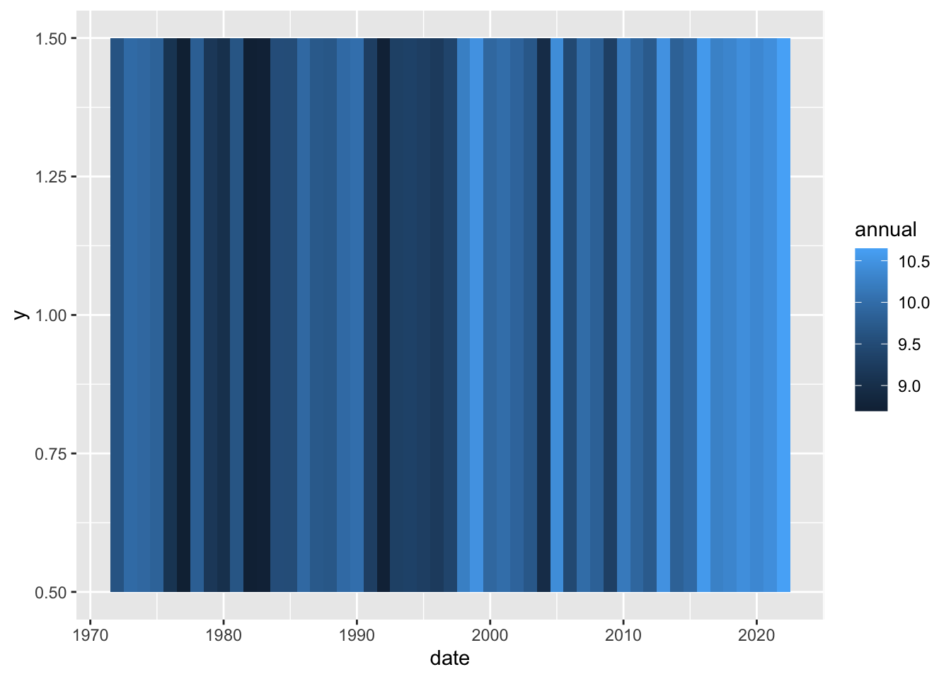
To get the colour scale to represent how far the annual temperature is from average, this chunk defines the min, max and mean across the whole dataset and then uses scale_fill_gradient() to colour the tiles.
maxmin <- range(qmean$annual, na.rm = T)
md <- mean(qmean$annual, na.rm = T)


qmean %>%
    ggplot(aes(x = date, y = 1, fill = annual)) +
  geom_tile() +
  scale_fill_gradientn(colors = rev(col_strip),
                       values = scales::rescale(c(maxmin[1], md, maxmin[2])),
                       na.value = "gray80") +
  scale_x_continuous(limits = c(1972, 2022), expand = c(0,0), breaks = seq(1972,2022, 10)) +
  labs(
    title = "Queenstown 1972-2022",
    caption = "Data: Stats NZ",
    x = "Year") +
  coord_cartesian(expand = FALSE) +
  theme_strip() +
  easy_remove_axes(which = "x")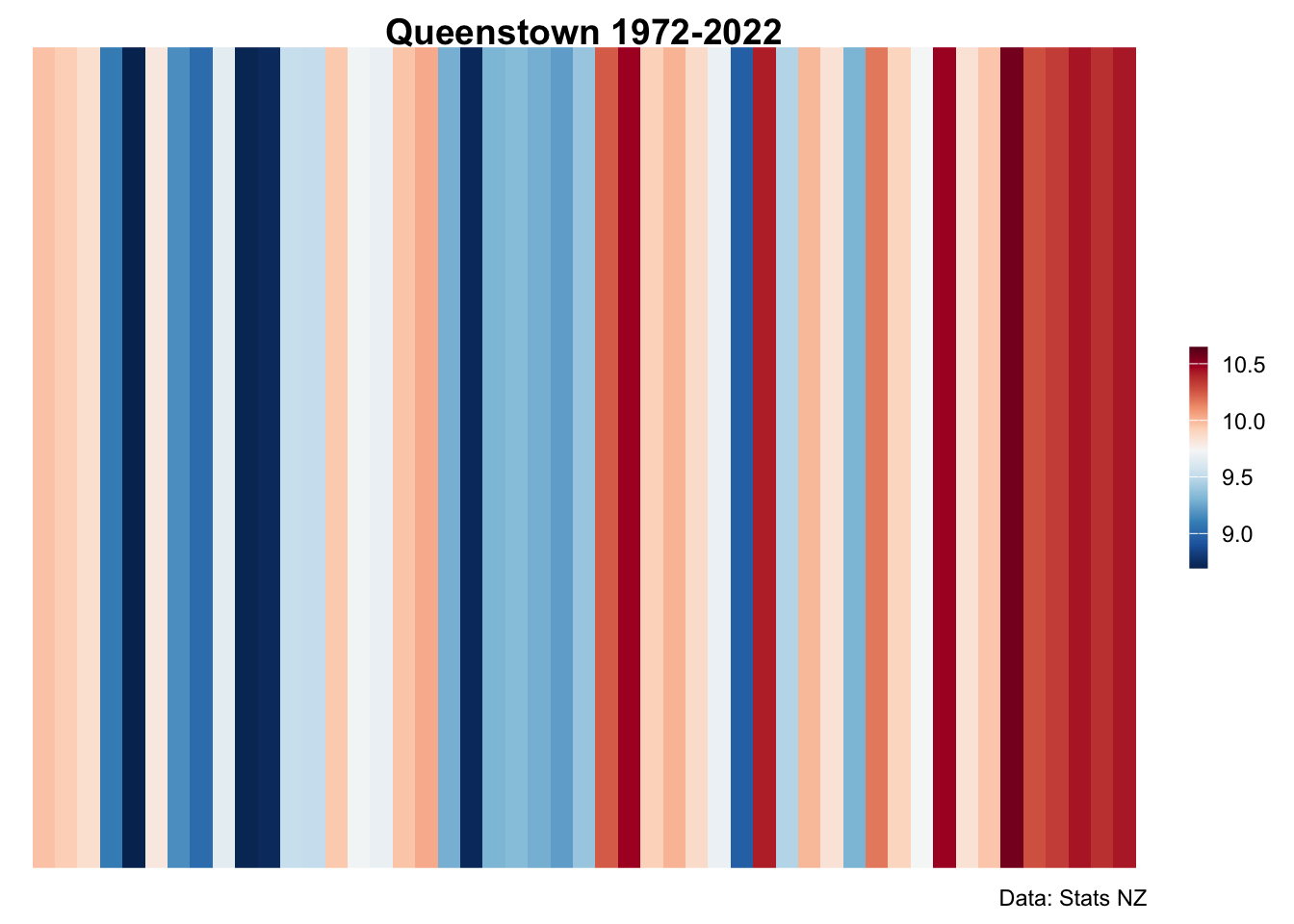
Too easy! Thanks Dominic!