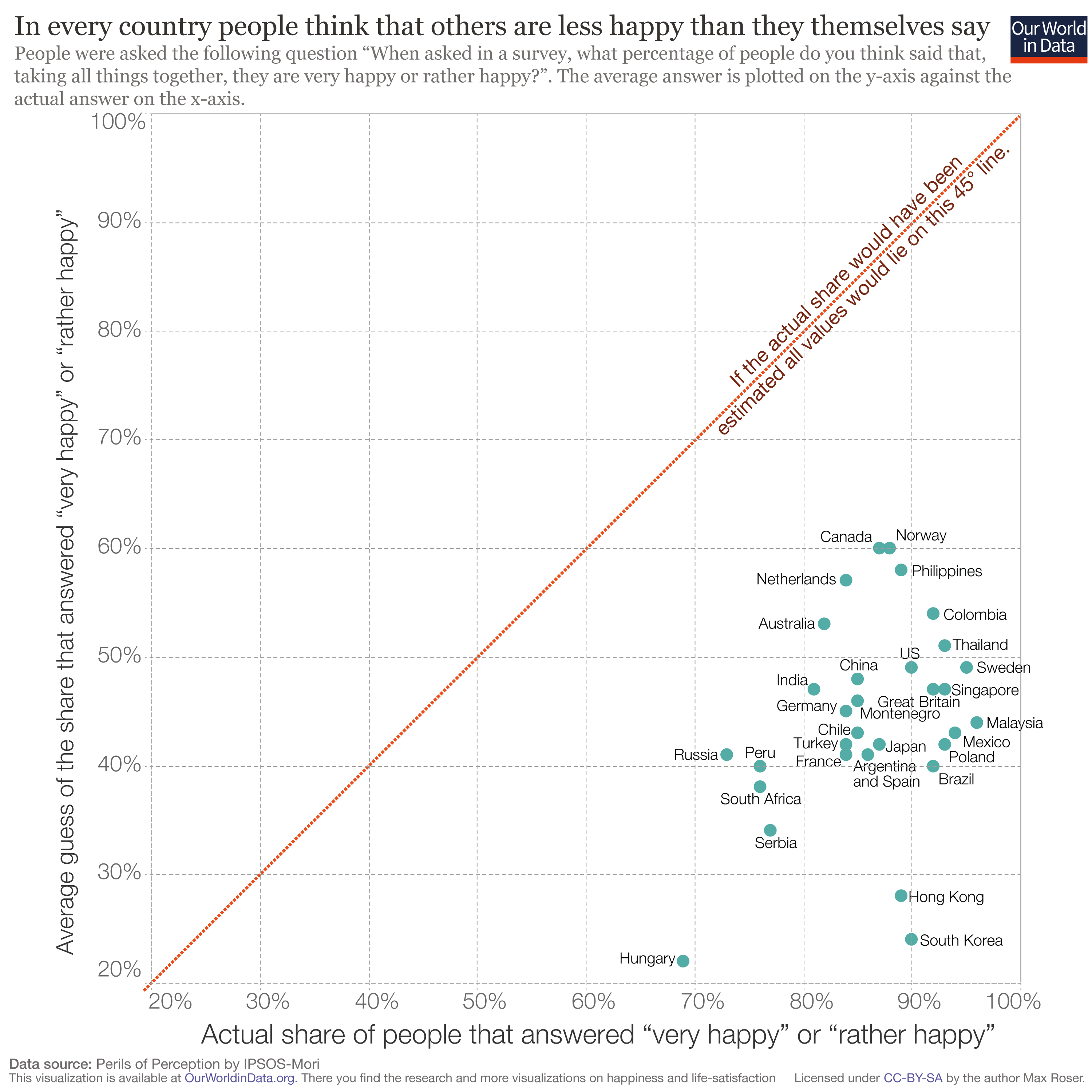
Exploring OurWorldinData this morning looking for plots that might fit the negative theme for today and this article caught my eye.
Apparently we vastly underestimate how happy other people are. Much like my Day 1 plot re climate action, when asked how happy they are and how happy they think other people in their country are, we judge others negatively, rating them to be much less happy than we are ourselves.
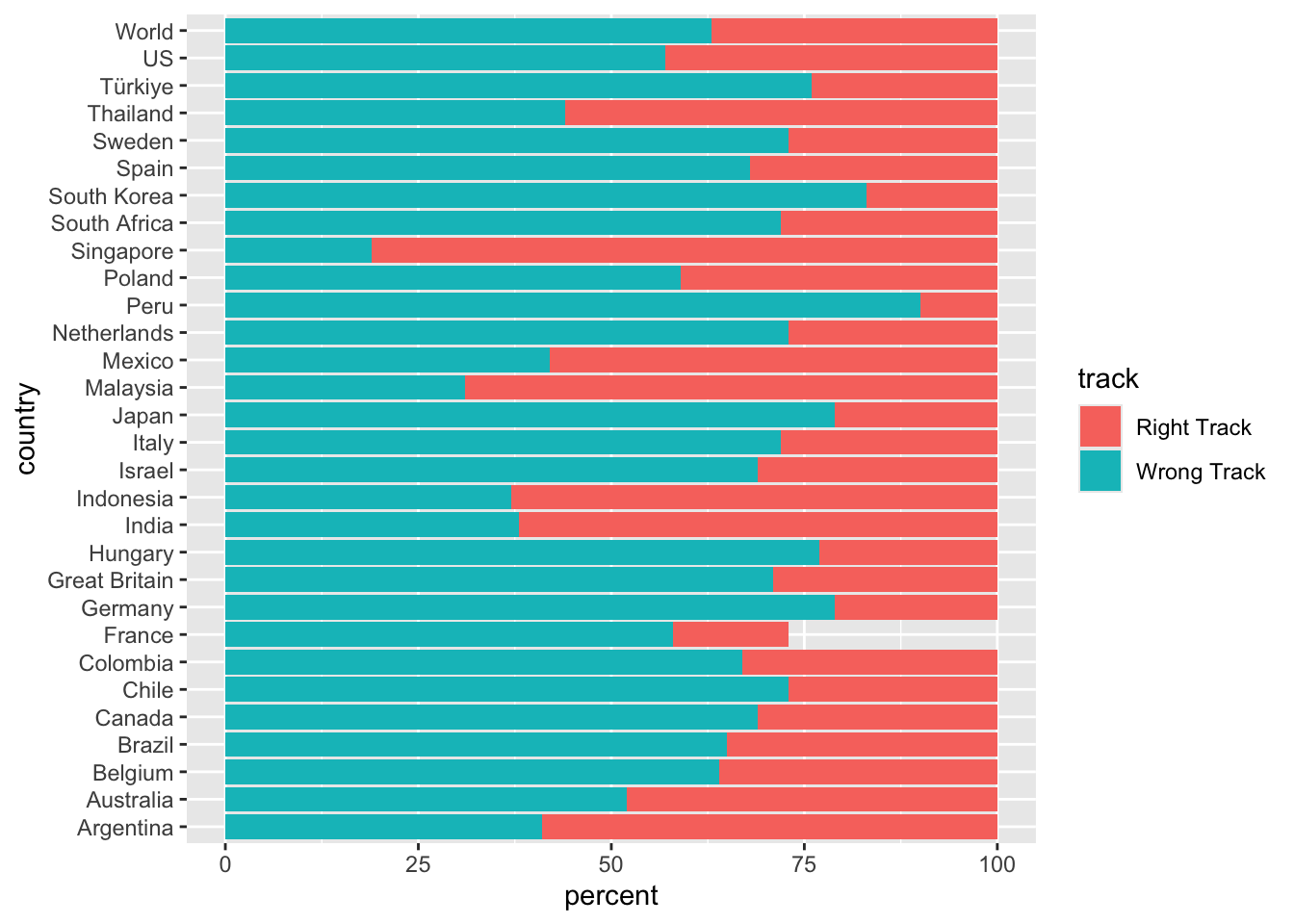
Sadly I couldn’t find the data from that plot to reproduce it, but in exploring the IPSOS website, I found this article about what worries the world in March 2025. The data was downloadable and I think probably better represented as stacked bars rather than pie charts, so that is my challenge for today.
get the data
Here I am reading the data from csv and making it into long format.
right_wrong_long %>%ggplot(aes(x = country, y = percent, fill = track)) +geom_col() +coord_flip()
Basic plot check! Things I would like to change…
something weird is going on with France, that is obviously a data entry error- exclude France
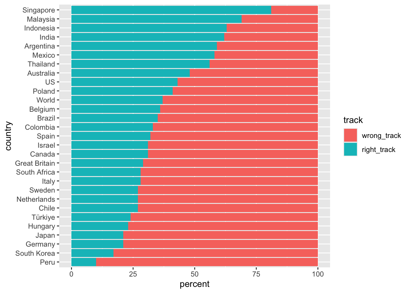
I would like to order the bars from highest right track to lowest
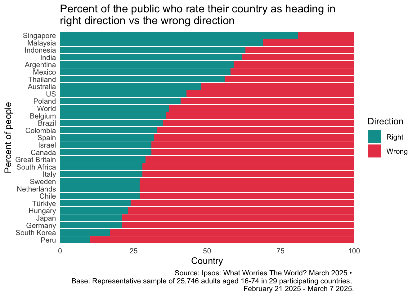
fix the theme and colours, add titles and data annotations
bar order
I need to turn country into a factor based on the percent values highest to lowest, but I am not sure how to do that with the data long, because for some countries the max percent value is the Right Track and for other countries the max is the Wrong Track value.
Maybe I need to make the data wide, with Right and Wrong track in separate columns first??
Great! Peru has the lowest value and Singapore has the highest value. Now what happens to the country factor when I make the data long again? Does the order stick around??
right_wrong_long_new %>%filter(country !="France") %>%ggplot(aes(x = country, y = percent, fill = track)) +geom_col() +coord_flip()
colours etc
I learned a few things about legend control here. I didn’t know previously that you could change the legend title and labels within the scale_fill_manual() function. I also used guides(fill = guide_legend(reverse = TRUE) to reverse the order of the legend display (so that Right appeared above Wrong), even when that order was the opposite of the factor levels.
palette <-c ("#e94554", "#009d9c")p <- right_wrong_long_new %>%filter(country !="France") %>%ggplot(aes(x = country, y = percent, fill = track)) +scale_fill_manual(values = palette, name ="Direction", labels =c("Wrong", "Right")) +geom_col() +coord_flip() +theme_minimal() +easy_remove_gridlines() +scale_y_continuous(expand =c(0,0)) +labs(y ="Country", x ="Percent of people", title ="Percent of the public who rate their country as heading in \nright direction vs the wrong direction", caption ="Source: Ipsos: What Worries The World? March 2025 • \nBase: Representative sample of 25,746 adults aged 16-74 in 29 participating countries, \nFebruary 21 2025 - March 7 2025.") +guides(fill =guide_legend(reverse =TRUE))p