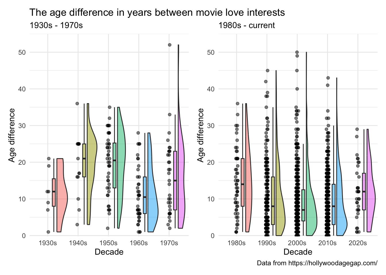
Day 22 and the prompt is stars. Here I am looking at the age differences between love interests in Hollywood movies. Data found on Kaggle and downloaded from https://hollywoodagegap.com .
library (tidyverse)library (here)library (janitor)library (ggrain)library (ggeasy)library (patchwork)<- read_csv (here ("charts" , "2025-04-22_stars" , "hollywood age.csv" )) %>% clean_names () %>% select (movie_name, release_year, age_difference)glimpse (age_diff)
Rows: 1,203
Columns: 3
$ movie_name     <chr> "Harold and Maude", "Venus", "The Quiet American", "Sol…
$ release_year   <dbl> 1971, 2006, 2002, 2009, 1998, 2010, 1992, 2016, 2009, 1…
$ age_difference <dbl> 52, 50, 49, 45, 45, 43, 42, 41, 40, 39, 38, 38, 36, 36,…
plot
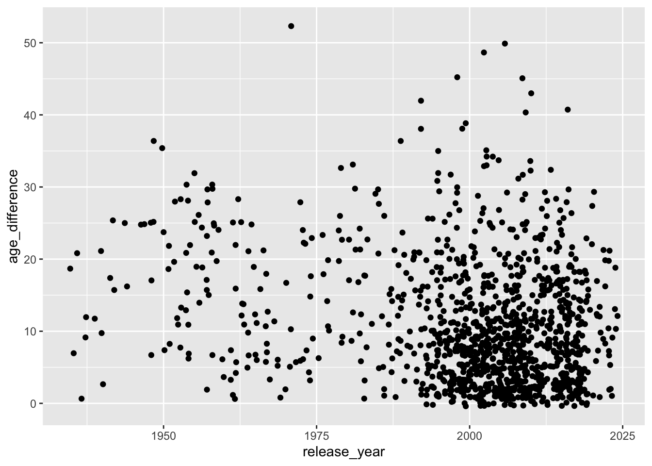
The increase in the number of movies made across this period makes any change in age difference over time difficult to see. Maybe creating a new variable that groups movies into decade will help.
%>% ggplot (aes (x = release_year, y = age_difference)) + geom_jitter ()
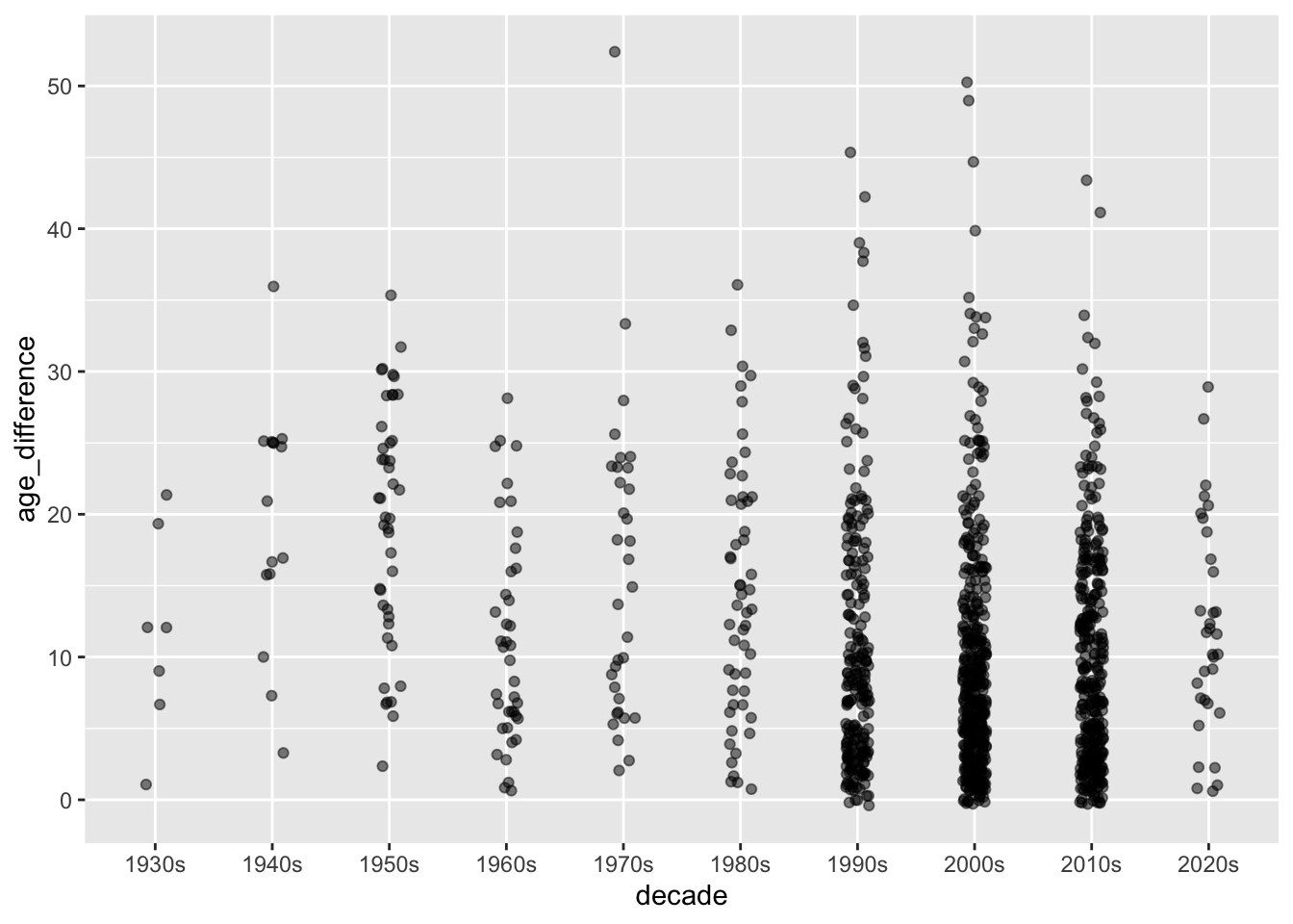
Here I am making a new decade column using case_when() .
<- age_diff %>% mutate (decade = case_when (release_year < 1940 ~ "1930s" , >= 1940 & release_year < 1950 ~ "1940s" , >= 1950 & release_year < 1960 ~ "1950s" , >= 1960 & release_year < 1970 ~ "1960s" , >= 1970 & release_year < 1980 ~ "1970s" , >= 1980 & release_year < 1990 ~ "1980s" , >= 1990 & release_year < 2000 ~ "1990s" , >= 2000 & release_year < 2010 ~ "2000s" , >= 2010 & release_year < 2020 ~ "2010s" , >= 2020 & release_year < 2030 ~ "2020s"
And plotting by decade instead of release year.
%>% ggplot (aes (x = decade, y = age_difference)) + geom_jitter (width = 0.1 , alpha = 0.5 )
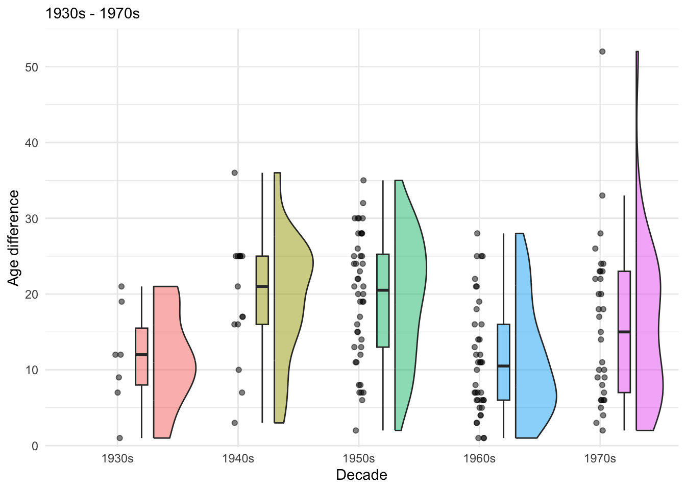
I haven’t tried a raincloud plot in a while- this might be a good use case. Raincloud plot combine raw points, box plot, and half violin to get a good idea of the distribution of the data.
Quick google and found the ggrain package
Code
<- age_diff_decade %>% filter (release_year < 1980 ) %>% ggplot (aes (x = decade, y = age_difference, fill = decade)) + geom_rain (alpha = .5 , boxplot.args.pos = list (width = .1 , position = position_nudge (x = 0.2 )),violin.args.pos = list (side = "r" ,width = 0.7 , position = position_nudge (x = 0.3 ))) + theme_minimal () + easy_remove_legend () + scale_y_continuous (expand = c (0 ,0 ), limits = c (- .2 , 55 )) + labs (y = "Age difference" , x = "Decade" , subtitle = "1930s - 1970s" )
Code
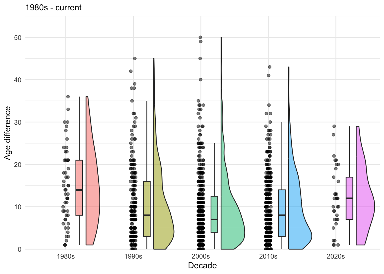
<- age_diff_decade %>% filter (release_year >= 1980 ) %>% ggplot (aes (x = decade, y = age_difference, fill = decade)) + geom_rain (alpha = .5 , boxplot.args.pos = list (width = .1 , position = position_nudge (x = 0.2 )),violin.args.pos = list (side = "r" ,width = 0.7 , position = position_nudge (x = 0.3 ))) + theme_minimal () + easy_remove_legend () + scale_y_continuous (expand = c (0 ,0 ), limits = c (- .2 , 55 )) + labs (y = "Age difference" , x = "Decade" , subtitle = "1980s - current" )
Here I am using the patchwork package to combine the plots
+ labs (title = "The age difference in years between movie love interests" ) + + labs (caption = "Data from https://hollywoodagegap.com/" )