It looks like there is data for the school year going back to 2009- maybe that would be cool to animate later but for the moment I am interested in the most recent school year.
vax2324 <- vax %>%filter(year =="2023")
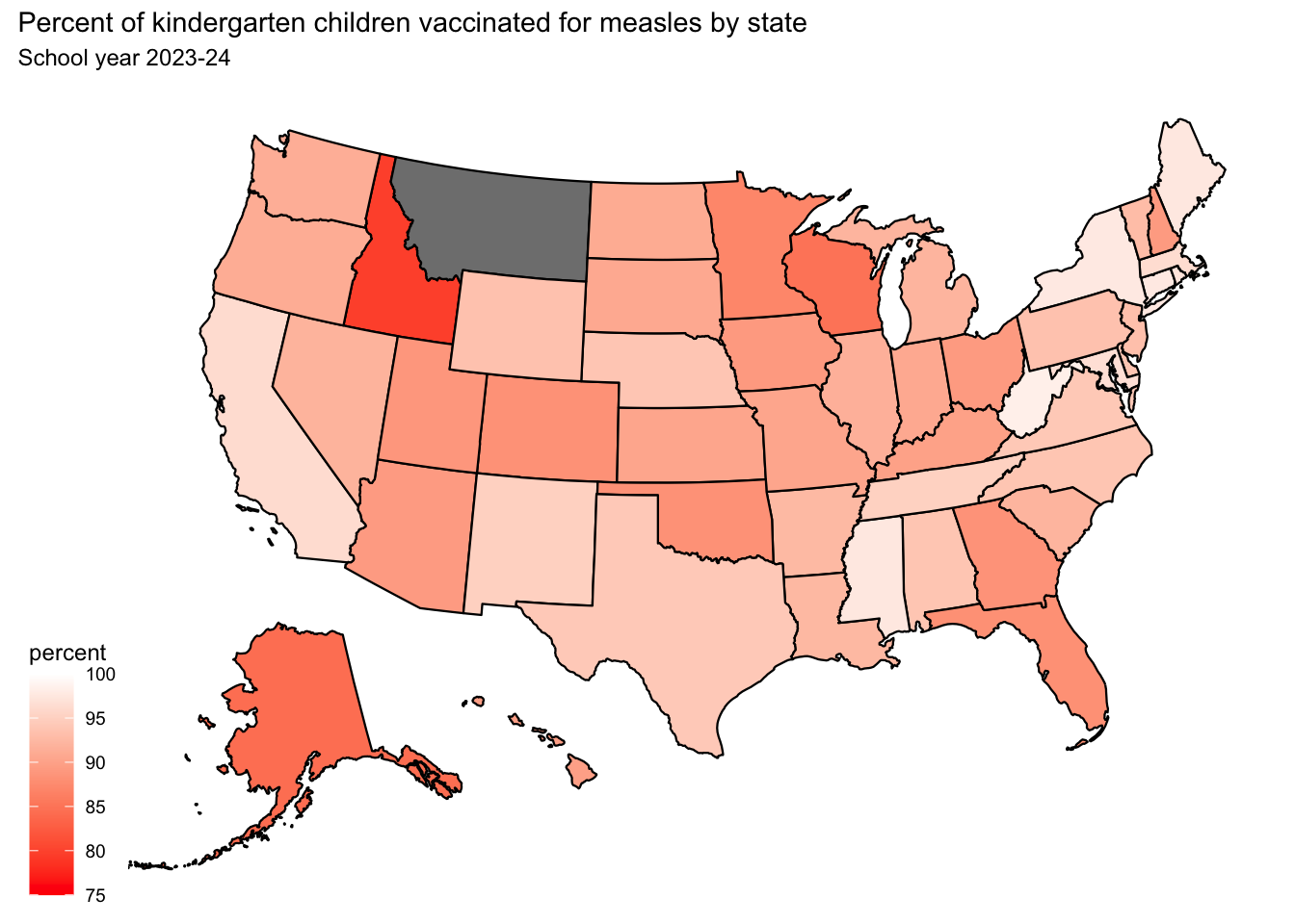
The dataset has vax rates as both percent estimate and categories. First I am going to try colouring by the numeric percent values. I would like the lowest to show up red.
min(vax2324$estimate_pct)
[1] 79.6
max(vax2324$estimate_pct)
[1] 98.3
plot_usmap(data = vax2324, values ="estimate_pct", labels=FALSE) +scale_fill_continuous(low ="red", high ="white", name ="percent", limits =c(75,100)) +labs(title ="Percent of kindergarten children vaccinated for measles by state", subtitle ="School year 2023-24")
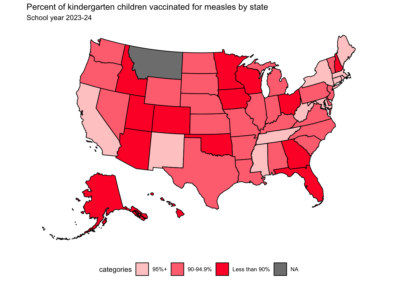
What would it look like if we used the categories instead?
vax2324$categories <-fct_relevel(vax2324$categories, c("95%+", "90-94.9%", "Less than 90%"))levels(vax2324$categories)
[1] "95%+" "90-94.9%" "Less than 90%"
plot_usmap(data = vax2324, values ="categories", labels=FALSE) +scale_fill_manual(values =c("#ffcccc", "#ff7380", "#ff1933")) +labs(title ="Percent of kindergarten children vaccinated for measles by state", subtitle ="School year 2023-24") +theme(legend.position ="bottom")
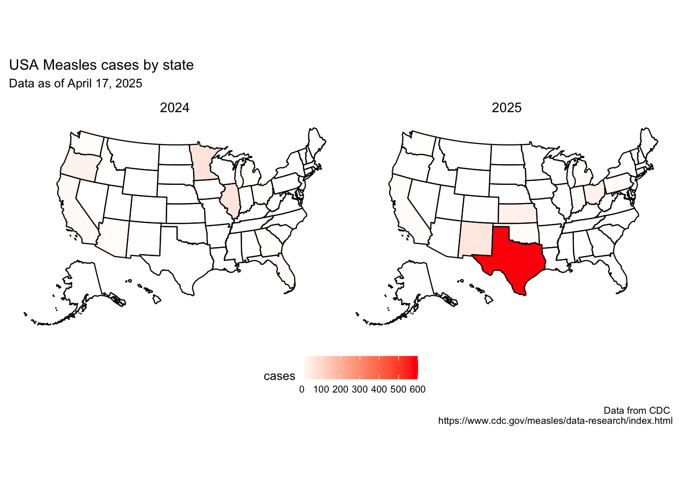
measles cases
plot_usmap(data = cases2425, values ="cases_calendar_year", labels=FALSE) +scale_fill_continuous(low ="white", high ="red", name ="cases", limits =c(0,600)) +labs(title ="USA Measles cases by state", subtitle ="Data as of April 17, 2025", caption ="Data from CDC \nhttps://www.cdc.gov/measles/data-research/index.html") +facet_wrap(~ year) +theme(legend.position ="bottom",strip.background =element_blank(),strip.text =element_text(color ="black", size =10) )