The Day 27 prompt is noise and I am interested in finding some data illustrating how noise pollution might impact our health. It was a bit hard to find interesting plots that had open data for this theme, but this Super Bowl noise data from Apple Hearing Study was available on Github.
I think the plots in this writeup are interesting, both because it seems that game days (red line) are noisier than regular Sundays (dotted black) and that the magnitude of that difference is bigger in game states. Also if you tab across these panels, it seems that games are getting noisier over this period.
That said, I really dislike the way the authors have messed with the y axis scale here. It is possible that there has been some smoothing going on too. Lets see what this data looks like without that manipulation.
scale (is it possible to reproduce the weird y axis scale?)
grey rectangle highlight
annotations and titles
theme/colours
Here I am getting rid of the grey background with theme_minimal and using ggeasy::easy_remove_gridlines to remove the vertical grid. Took me a while to realise that I had to specify both colour and linetype in my main aesthetic, in order to make one line block and dashed and the other solid red.
Fixing the axis labels, adding a title and annotations
Code
sb %>%ggplot(aes(x = hours_to_game_begin, y = avg_leq, colour = super_bowl_sunday, linetype = super_bowl_sunday)) +geom_line() +facet_grid(year~game_zone) +theme_minimal() +easy_remove_gridlines(axis =c("x")) +scale_colour_manual(values =c("black", "red")) +scale_linetype_manual(values =c("dashed", "solid")) +easy_remove_legend() +annotate("rect", xmin =0, xmax =3.5, ymin =-Inf, ymax =Inf, alpha =0.1, fill ="darkgrey") +scale_x_continuous(limits =c(-6, 9), breaks=seq(-6, 9, 3)) +scale_y_continuous(breaks=seq(50, 70, 10)) +labs(title ="Super Bowl Sunday noise exposure in decibels", x ="Hours from start of Super Bowl", y ="Average noise exposure (in decibels)", caption ="Data from Apple Hearing Study") +geom_text(data =data.frame(x =-1.3, y =53, label ="Start game \n6:30 PM EST", game_zone ="Game States", year ="2024"),mapping =aes(x = x, y = y, label = label),size =2, inherit.aes =FALSE) +geom_text(data =data.frame(x =2.3, y =53, label ="End game \n10:00 PM EST", game_zone ="Game States", year ="2024"),mapping =aes(x = x, y = y, label = label),size =2, inherit.aes =FALSE) +geom_text(data =data.frame(x =-1.3, y =53, label ="Start game \n6:30 PM EST", game_zone ="Non-game States", year ="2024"),mapping =aes(x = x, y = y, label = label),size =2, inherit.aes =FALSE) +geom_text(data =data.frame(x =2.3, y =53, label ="End game \n10:00 PM EST", game_zone ="Non-game States", year ="2024"),mapping =aes(x = x, y = y, label = label),size =2, inherit.aes =FALSE) +theme(panel.spacing =unit(1, "lines"))
bonus
split by year and use map() to create separate plots
I want to create a panel set like the one at the top of the post with my plots across years, so have used this code to map the ggplot code across each year, exporting each plot to png.
Code
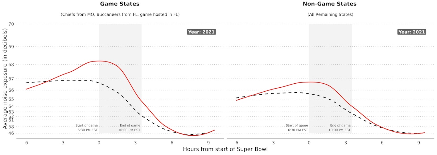
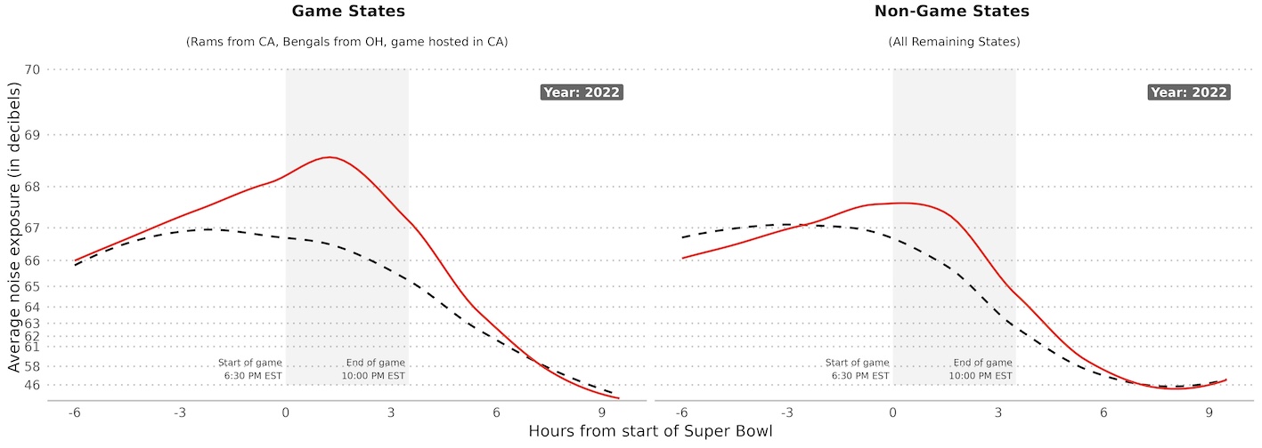
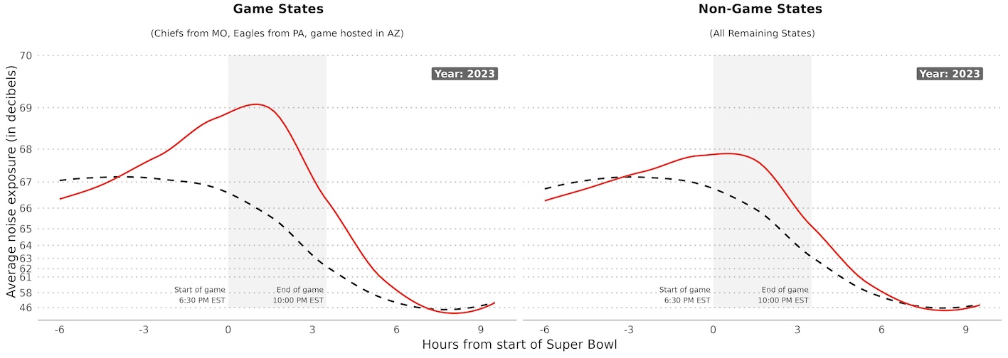
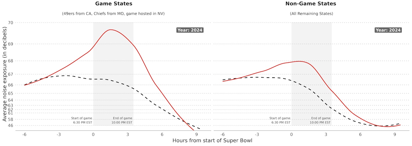
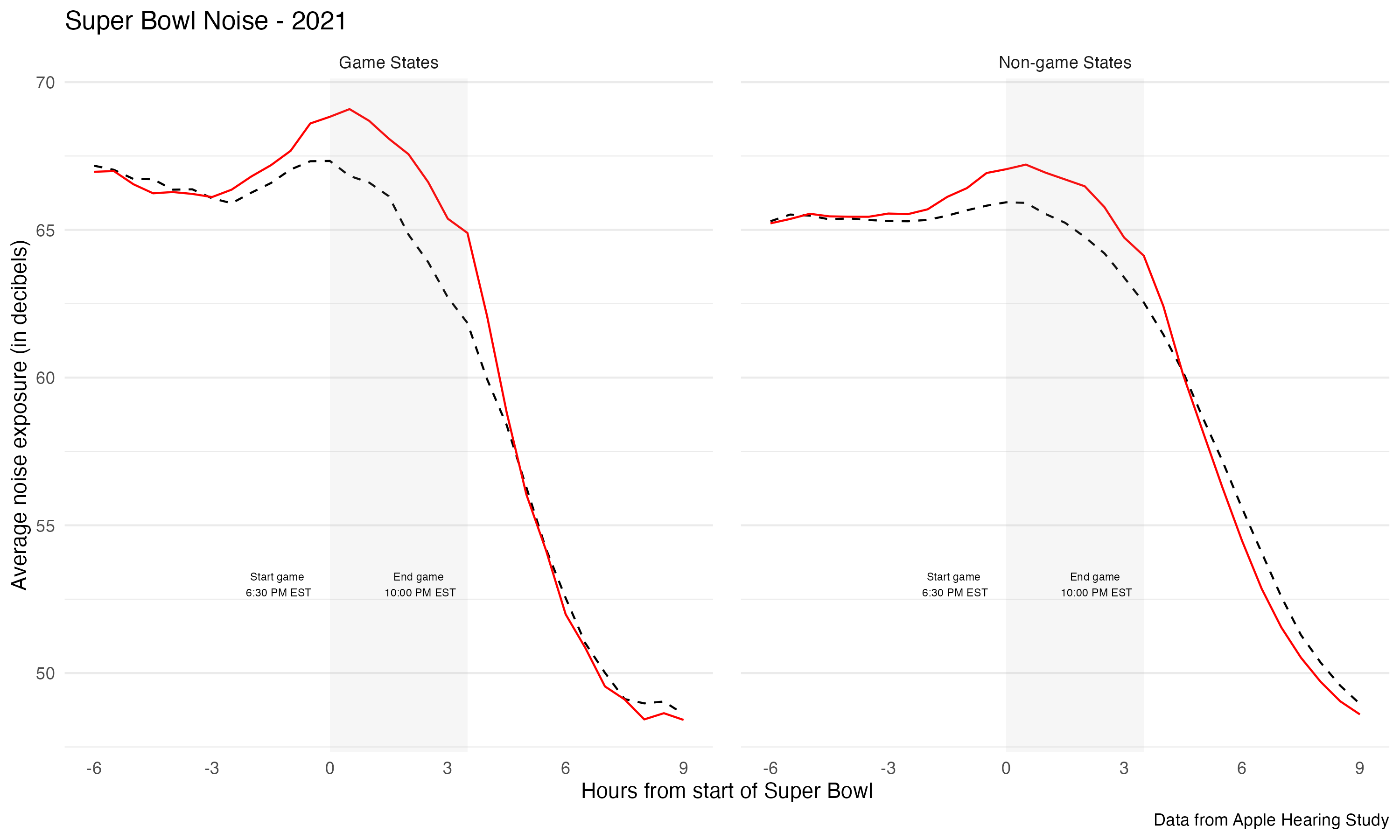
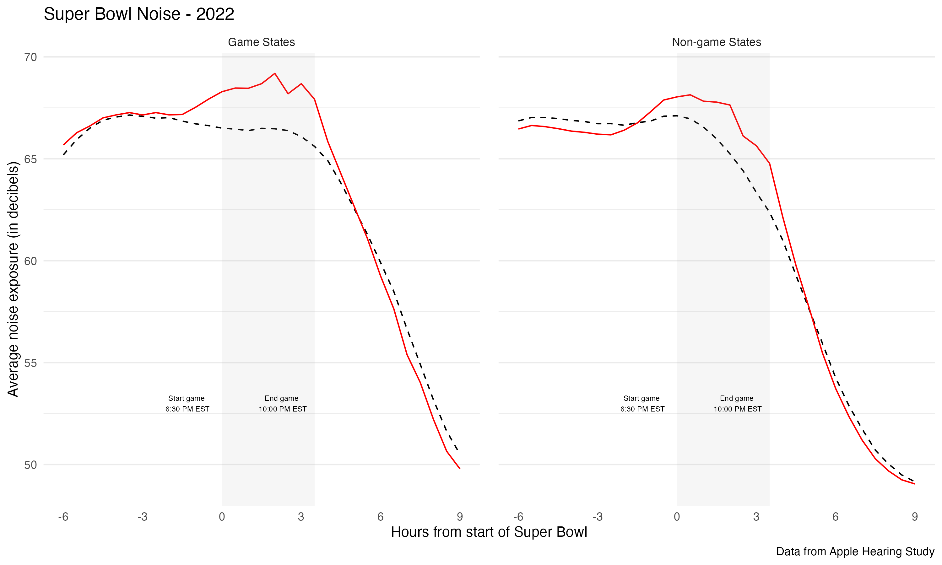
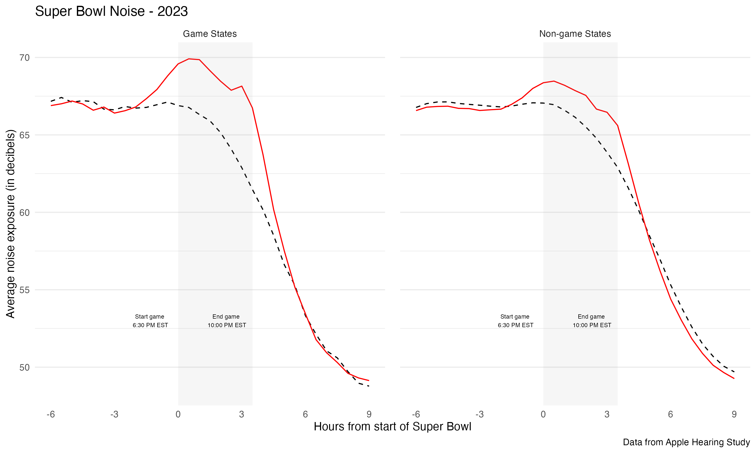
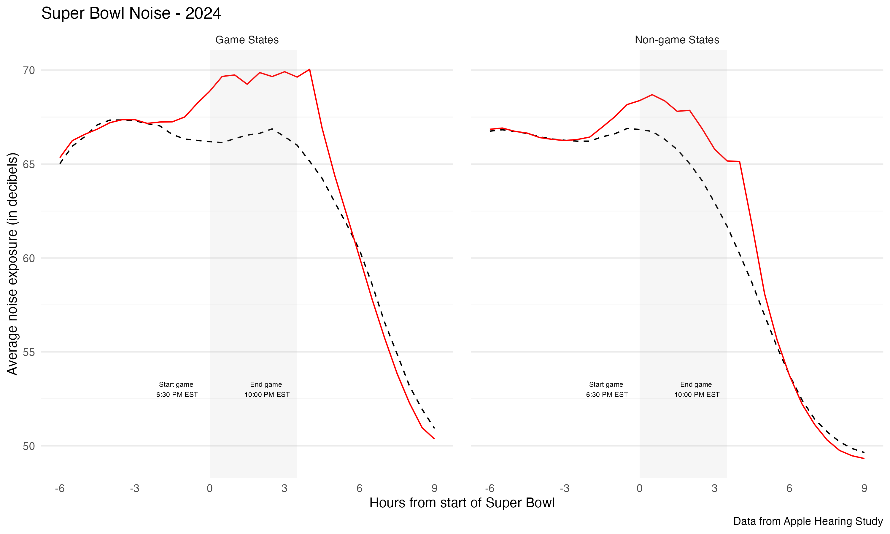
# Split the data by year and create separate plotsyear_plots <- sb %>%group_split(year) %>%map(~{ year_val <-unique(.x$year)
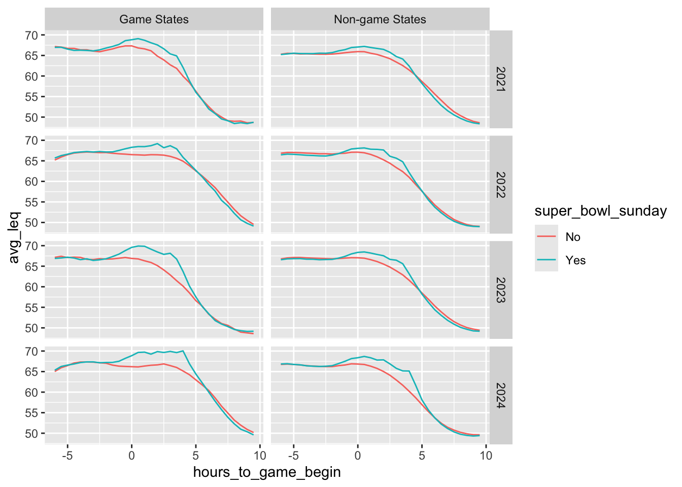
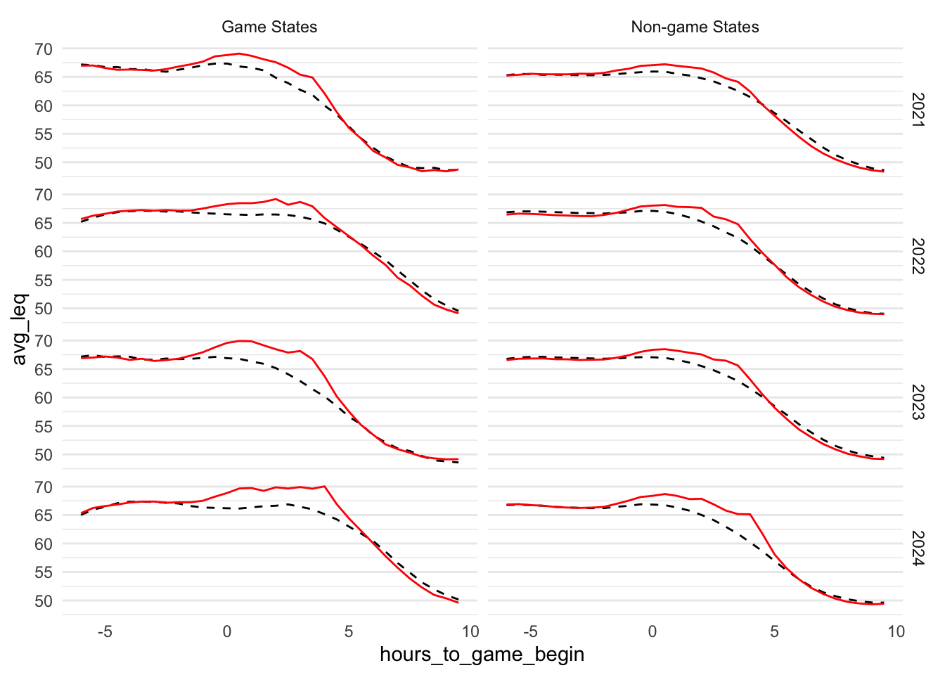
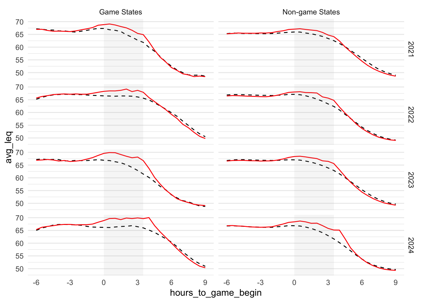
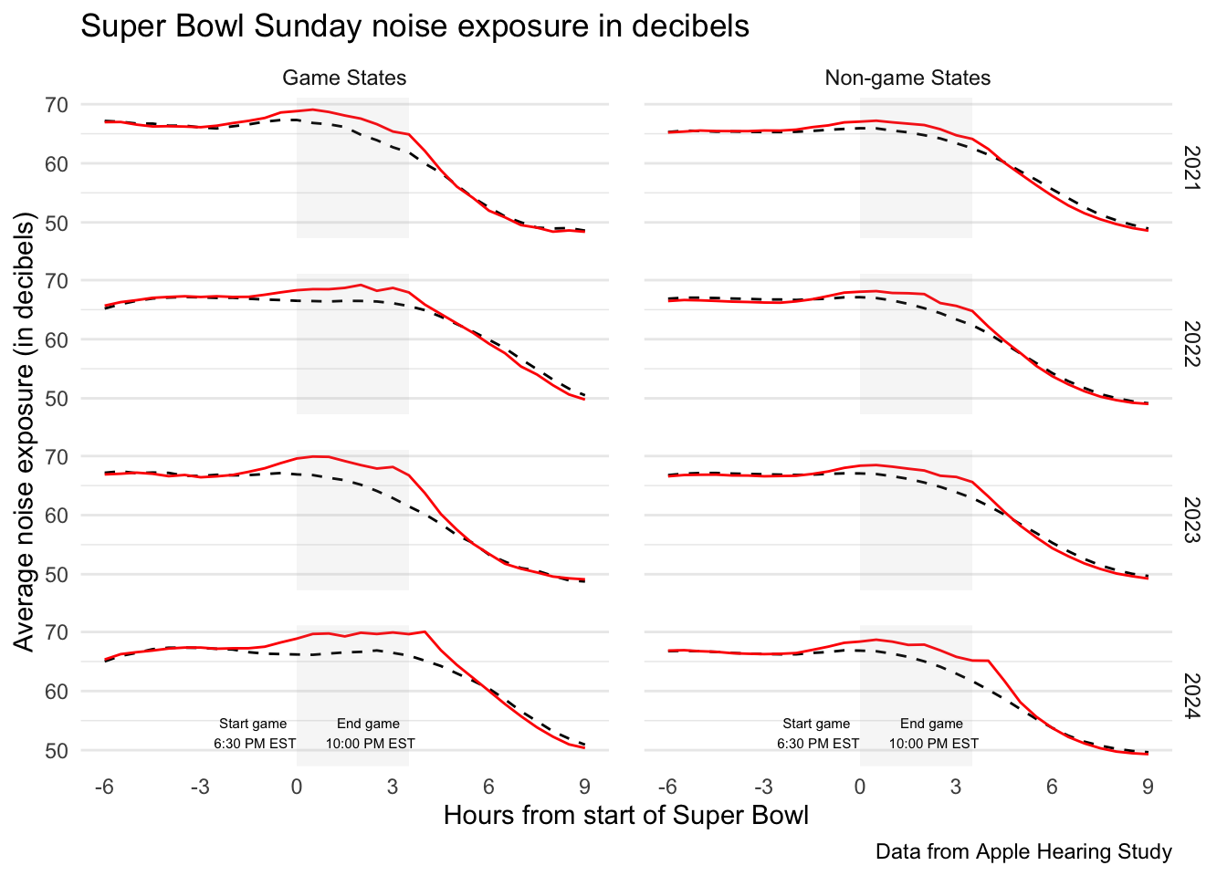
ggplot(.x, aes(x = hours_to_game_begin, y = avg_leq, colour = super_bowl_sunday, linetype = super_bowl_sunday)) +geom_line() +facet_grid(. ~ game_zone) +ggtitle(paste("Super Bowl Noise -", year_val)) +theme_minimal() +easy_remove_gridlines(axis =c("x")) +scale_colour_manual(values =c("black", "red")) +scale_linetype_manual(values =c("dashed", "solid")) +easy_remove_legend() +annotate("rect", xmin =0, xmax =3.5, ymin =-Inf, ymax =Inf, alpha =0.1, fill ="darkgrey") +scale_x_continuous(limits =c(-6, 9), breaks=seq(-6, 9, 3)) +scale_y_continuous(breaks=seq(50, 70, 5)) +labs( x ="Hours from start of Super Bowl", y ="Average noise exposure (in decibels)", caption ="Data from Apple Hearing Study") +ggtitle(paste("Super Bowl Noise -", year_val)) +geom_text(data =data.frame(x =-1.3, y =53, label ="Start game \n6:30 PM EST", game_zone ="Game States", year ="2024"),mapping =aes(x = x, y = y, label = label),size =2, inherit.aes =FALSE) +geom_text(data =data.frame(x =2.3, y =53, label ="End game \n10:00 PM EST", game_zone ="Game States", year ="2024"),mapping =aes(x = x, y = y, label = label),size =2, inherit.aes =FALSE) +geom_text(data =data.frame(x =-1.3, y =53, label ="Start game \n6:30 PM EST", game_zone ="Non-game States", year ="2024"),mapping =aes(x = x, y = y, label = label),size =2, inherit.aes =FALSE) +geom_text(data =data.frame(x =2.3, y =53, label ="End game \n10:00 PM EST", game_zone ="Non-game States", year ="2024"),mapping =aes(x = x, y = y, label = label),size =2, inherit.aes =FALSE) +theme(panel.spacing =unit(1, "lines")) }) # save all plotswalk2( year_plots,unique(sb$year),~ggsave(filename =paste0("superbowl_noise_", .y, ".png"), plot = .x, width =10, height =6))