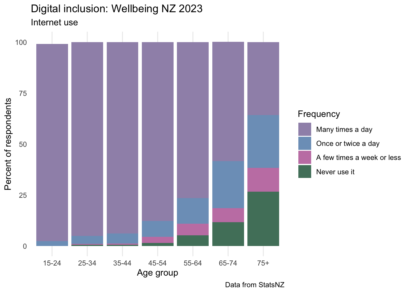
Stats NZ recently released an update to their Wellbeing 2023 dataset that included variables related to digital inclusion. I downloaded the raw dataset from the site and used this script to do a bit of cleaning before reading the data into RStudio and plotting how internet use and satisfaction differs across the lifespan below.
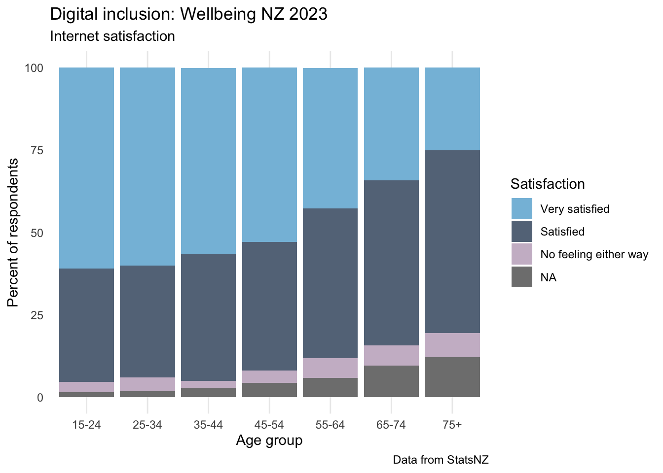
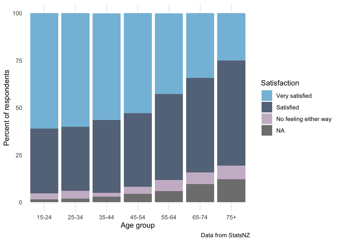
I found it particularly interesting that more than half of kiwis 75+ use the internet daily, but older people are less likely to say they are very satisfied with the internet than are younger people.
get data
Code
library(tidyverse)library(here)library(ggeasy)age_use <-read_csv(here("charts/2025-04-28_inclusion/age_group.csv")) %>%filter(category =="Internet use") %>%mutate(response =factor(response, levels =c("Many times a day", "Once or twice a day", "A few times a week or less", "Never use it"))) %>%mutate(age =factor(age, levels =c("15-24", "25-34","35-44", "45-54","55-64","65-74","75+"))) %>%mutate(estimate =as.numeric(estimate)) %>%select(category, age, response, estimate)age_sat <-read_csv(here("charts/2025-04-28_inclusion/age_group.csv")) %>%filter(category =="Internet satisfaction") %>%mutate(response =factor(response, levels =c("Very satisfied", "Satisfied", "No feeling either way", "Dissatisfied/very dissatisfied"))) %>%mutate(age =factor(age, levels =c("15-24", "25-34","35-44", "45-54","55-64","65-74","75+"))) %>%mutate(estimate =as.numeric(estimate)) %>%select(category, age, response, estimate)
plot
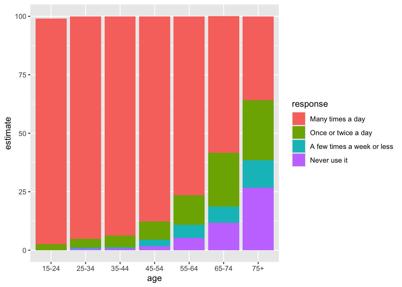
age_use %>%ggplot(aes(x = age, y = estimate, fill = response)) +geom_col()
Basic plot check! Things I would like to change…
colour scheme
theme
axis and legend labels
title/caption
make same style plot for internet satisfaction
combine plot using panel tabset
colours/themes etc
palette1 <-c ("#A092B7", "#7d9fc2", "#C582B2", "#51806a") # Kereru from manu packagepalette2 <-c("#85BEDC", "#647588" , "#CCBBCD") # Korora from manu packageage_use %>%ggplot(aes(x = age, y = estimate, fill = response)) +geom_col() +scale_fill_manual(values = palette1) +easy_add_legend_title("Frequency") +labs(y ="Percent of respondents", x ="Age group", , title ="Digital inclusion: Wellbeing NZ 2023", subtitle ="Internet use", caption ="Data from StatsNZ") +theme_minimal() +easy_remove_gridlines(axis ="y")
same plot for satisfaction
age_sat %>%ggplot(aes(x = age, y = estimate, fill = response)) +geom_col() +scale_fill_manual(values = palette2) +easy_add_legend_title("Satisfaction") +labs(y ="Percent of respondents", x ="Age group", title ="Digital inclusion: Wellbeing NZ 2023", subtitle ="Internet satisfaction", caption ="Data from StatsNZ") +theme_minimal() +easy_remove_gridlines(axis ="y")