library(tidyverse)library(tidytuesdayR)library(tidyplots)library(janitor)library(ggeasy)library(Manu)library(here)# choosing a dataset randomlyset.seed(1)ttyears <-c(2018:2025)ttweeks <-c(1:52)# choose a year at randomchosen_year <-sample(ttyears, size =1)# choose at week at randomchosen_week <-sample(ttweeks, size =1)# read the data from that year/weekdf <- tidytuesdayR::tt_load(chosen_year, chosen_week)# print datasetprint(df)salaries <- df[[1]]
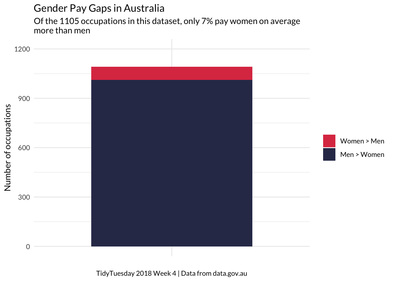
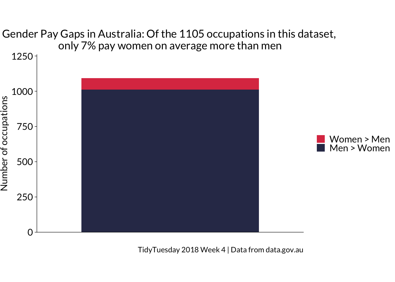
The data for this plot comes from a 2018 TidyTuesday challenge. The Week 4 data that year was about Australian Salaries. I was interested in differences in the average salary of men and women in different occupations. The 30DayChartChallenge theme today is part to whole, so I decided to plot the proprotion of occupations in which women are paid more than men. It would be interesting to know whether this stat has improved since 2018.
data prep
Code
# make new column flagging occupations where women get paid moresalaries_gender <- salaries %>%select(-1, -2, -individuals) %>%pivot_wider(names_from = gender, values_from = average_taxable_income) %>%rowwise() %>%mutate(salary_diff = Female - Male) %>%ungroup() %>%mutate(bias =case_when(salary_diff >0~1, salary_diff <0~0)) %>%# tag occupations where women are paid more on average with 1mutate(direction =case_when(bias ==0~"Men > Women", bias ==1~"Women > Men")) |>filter(!is.na(direction)) # count occupations where women are paid more, set up labels, remove NAssummary <- salaries_gender %>%count(bias) %>%mutate(bias =factor(bias,levels =c(1, 0),labels =c("Women > Men", "Men > Women") )) %>%na.omit()
ggplot
Code
summary %>%ggplot(aes(x ="", y = n, fill = bias)) +geom_col(width =0.7) +labs(x =NULL,y ="Number of occupations",fill =NULL,title ="Gender Pay Gaps in Australia", subtitle ="Of the 1105 occupations in this dataset, only 7% pay women on average \nmore than men", caption ="TidyTuesday 2018 Week 4 | Data from data.gov.au" ) +theme_minimal(base_family ="Lato") +scale_fill_manual(values =get_pal("Takahe")) +scale_y_continuous(limits =c(0,1200), breaks =seq(0, 1200, 300)) +theme(plot.caption =element_text(hjust =0.5) # Centers the caption )
tidyplots
Code
salaries_gender |>tidyplot(colour = direction) |>add_barstack_absolute() |>adjust_size(unit ="mm", width =120, height =80) |>reorder_color_levels("Women > Men") |>adjust_y_axis_title("Number of occupations") |>adjust_colors(new_colors =c("#DD3C51", "#313657")) |>theme_tidyplot() |>remove_x_axis_ticks() |>remove_x_axis_title() |>adjust_y_axis(limits =c(0,1200)) |>adjust_font(fontsize =12, family ="Lato") |>adjust_title("Gender Pay Gaps in Australia: Of the 1105 occupations in this dataset, \nonly 7% pay women on average more than men", fontsize =14) |>adjust_caption("TidyTuesday 2018 Week 4 | Data from data.gov.au") |>remove_legend_title() |>save_plot(here::here("charts26", "2026-04-01_partwhole","tidyfeatured.png"))