library(tidyverse)library(tidytuesdayR)library(tidyplots)library(janitor)library(ggeasy)library(here)library(patchwork)# choosing a dataset randomlyset.seed(8888)ttyears <-c(2018:2025)ttweeks <-c(1:52)# choose a year at randomchosen_year <-sample(ttyears, size =1)# choose at week at randomchosen_week <-sample(ttweeks, size =1)# read the data from that year/weekdf <- tidytuesdayR::tt_load(2023, 34)# print datasetprint(df)pop <- df[[1]]options(scipen =999)
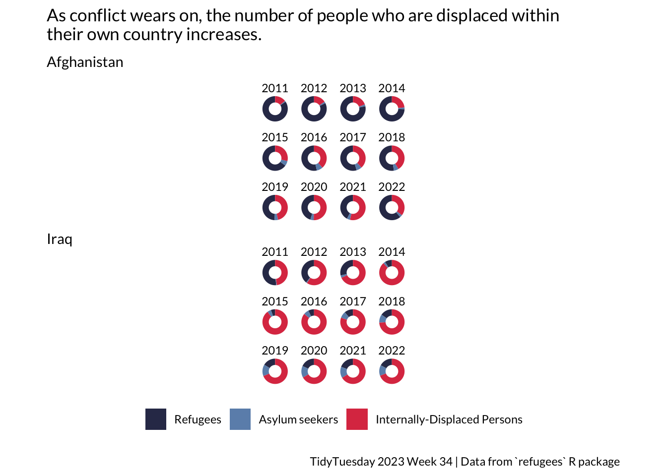
The data for this plot comes from a 2023 TidyTuesday challenge. The Week 34 data that year was about refugee populations between 2010 and 2022. I was interested in the relative numbers of refugees, asylum seekers and displaced persons from Iraq and Afghanistan during this period.
prep
Code
countries <-c("Afghanistan", "Iraq")# filter conflict zoneconflict <- pop %>%select(year, coo_name, coo, coa_name, coa, refugees, asylum_seekers, idps) %>%filter(coo_name %in% countries)# extract internally displaced personsidps <- conflict %>%filter(idps >0) %>%select(year, coo_name, coo_name, idps) %>%arrange(coo_name)# summarise total refugees and asylum seeker per year by country pof origintotal <- conflict %>%group_by(coo_name, year) %>%summarise(totalrefugees =sum(refugees), totalasylum =sum(asylum_seekers))joined <-left_join(total, idps, by=c("coo_name", "year")) %>%pivot_longer(names_to ="type", values_to ="number", totalrefugees:idps) %>%group_by(coo_name, year) %>%mutate(total =sum(number)) %>%rowwise() %>%mutate(proportion = number/total) %>%mutate(type = dplyr::recode(type,"totalrefugees"="Refugees","totalasylum"="Asylum seekers","idps"="Internally-Displaced Persons" )) %>%mutate(type =as_factor(type)) %>%mutate(coo_name =as_factor(coo_name))
ggplot
Code
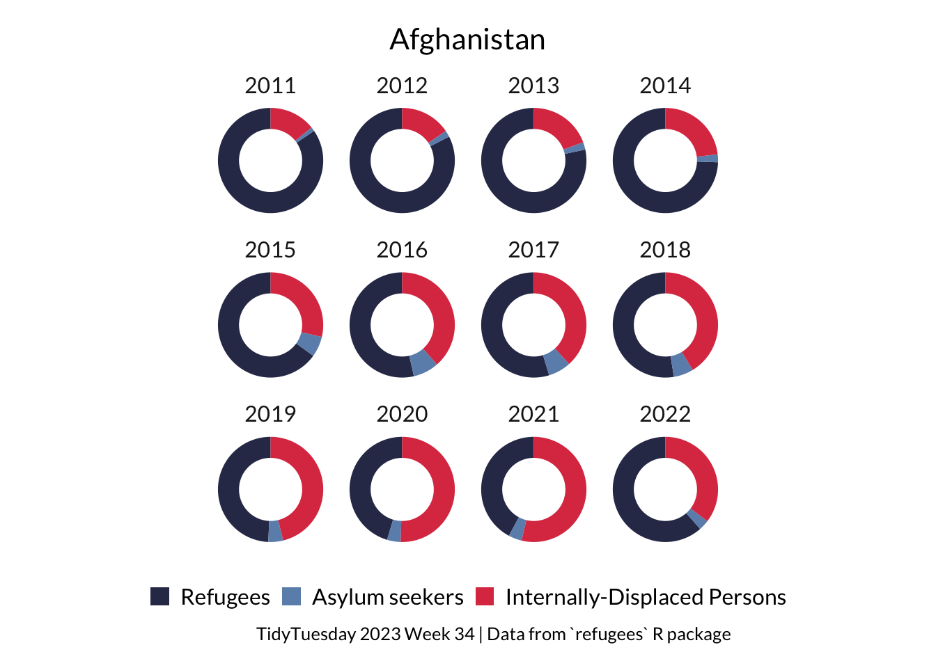
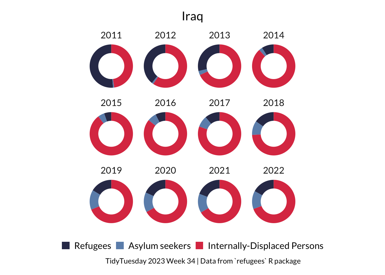
a <- joined %>%filter(coo_name =="Afghanistan", year >2010) %>%ggplot(aes(x =2, y = proportion, fill = type)) +geom_col(width =1) +coord_polar(theta ="y") +xlim(0.5, 2.5) +facet_wrap(~ year, nrow =3) +theme_void(base_family ="Lato") +easy_remove_legend() +scale_fill_manual(values =c("#313657", "#6C90B9", "#DD3C51")) +theme(plot.margin =margin(t =1, r =30, b =1, l =30), ) +labs(title ="As conflict wears on, the number of people who are displaced within \ntheir own country increases.", subtitle ="Afghanistan") +theme(plot.title =element_text(margin =margin(b =10)), plot.subtitle =element_text(margin =margin(b =10)), # space below subtitle # space below title )i <- joined %>%filter(coo_name =="Iraq", year >2010) %>%ggplot(aes(x =2, y = proportion, fill = type)) +geom_col(width =1) +coord_polar(theta ="y") +xlim(0.5, 2.5) +facet_wrap(~ year, nrow =3) +theme_void(base_family ="Lato") +easy_remove_legend_title() +scale_fill_manual(values =c("#313657", "#6C90B9", "#DD3C51")) +theme(plot.margin =margin(t =1, r =30, b =1, l =30), ) +labs(subtitle ="Iraq", caption ="TidyTuesday 2023 Week 34 | Data from `refugees` R package") +theme(plot.caption =element_text(margin =margin(t =10)),legend.position ="bottom",legend.margin =margin(t =10, b =10) # more space around legend )a / i
tidyplot
Tidyplots makes it super intuitive to make donut plots. Sadly it isn’t working with patchwork at the moment, so I couldn’t work out how to combine these plots. Also it doesn’t seem to have a way to add both a title and subtitle.
Code
joined %>%filter(coo_name =="Afghanistan", year >2010) %>%tidyplot(y = proportion, colour = type) %>%add_donut() %>%adjust_size(width =25, height =25) |>split_plot(by = year) %>%adjust_font(fontsize =12, family ="Lato") %>%adjust_title("Afghanistan", fontsize =16) %>%adjust_colors(new_colors =c("#313657", "#6C90B9", "#DD3C51")) %>%adjust_legend_position(position ="bottom") %>%remove_legend_title() %>%adjust_caption("TidyTuesday 2023 Week 34 | Data from `refugees` R package") %>%save_plot(here::here("charts26", "2026-04-08_circular", "tidyA.png"))
Code
joined %>%filter(coo_name =="Iraq", year >2010) %>%tidyplot(y = proportion, colour = type) %>%add_donut() %>%adjust_size(width =25, height =25) |>split_plot(by = year) %>%adjust_font(fontsize =12, family ="Lato") %>%adjust_title("Iraq", fontsize =16) %>%adjust_colors(new_colors =c("#313657", "#6C90B9", "#DD3C51")) %>%adjust_legend_position(position ="bottom") %>%remove_legend_title() %>%adjust_caption("TidyTuesday 2023 Week 34 | Data from `refugees` R package") %>%save_plot(here::here("charts26", "2026-04-08_circular", "tidyI.png"))