library(tidyverse)library(tidytuesdayR)library(tidyplots)library(tidytext)library(janitor)library(ggeasy)library(ggpubr)library(here)# choosing a dataset randomlyset.seed(1515)ttyears <-c(2018:2025)ttweeks <-c(1:52)# choose a year at randomchosen_year <-sample(ttyears, size =1)# choose at week at randomchosen_week <-sample(ttweeks, size =1)# read the data from that year/weekdf <- tidytuesdayR::tt_load(chosen_year, chosen_week)# print datasetprint(df)user <- df[[3]]options(scipen =999)set.seed(15)
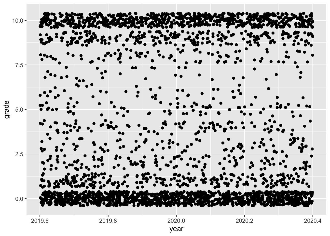
The data for this plot comes from a 2020 TidyTuesday challenge. The Week 19 data that year was about Animal Crossing reviews.
ggplot
Code
user <- user %>%mutate(year =year(date))user %>%ggplot(aes(x = year, y =grade)) +geom_jitter()
Code
ug <- user %>%select(user_name, grade)ut <-user %>%select(user_name, text)
Code
# turn reviews into tokens, remove stop wordswords <- ut %>%group_by(user_name) %>%unnest_tokens(word, text) %>%anti_join(stop_words)# join with afinn sentiment scores, group and summarise mean by usersentbyuser <- words %>%inner_join(get_sentiments("afinn")) %>%group_by(user_name) %>%summarise(sentiment =mean(value))# join sentiment scores with review scoresjoin <-left_join(sentbyuser, ug, by ="user_name")
Code
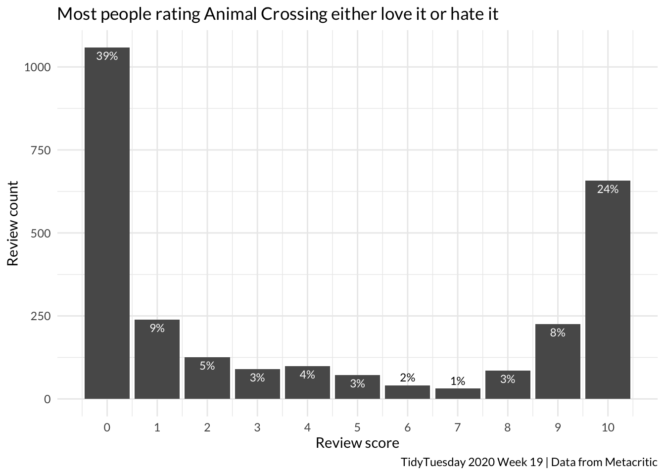
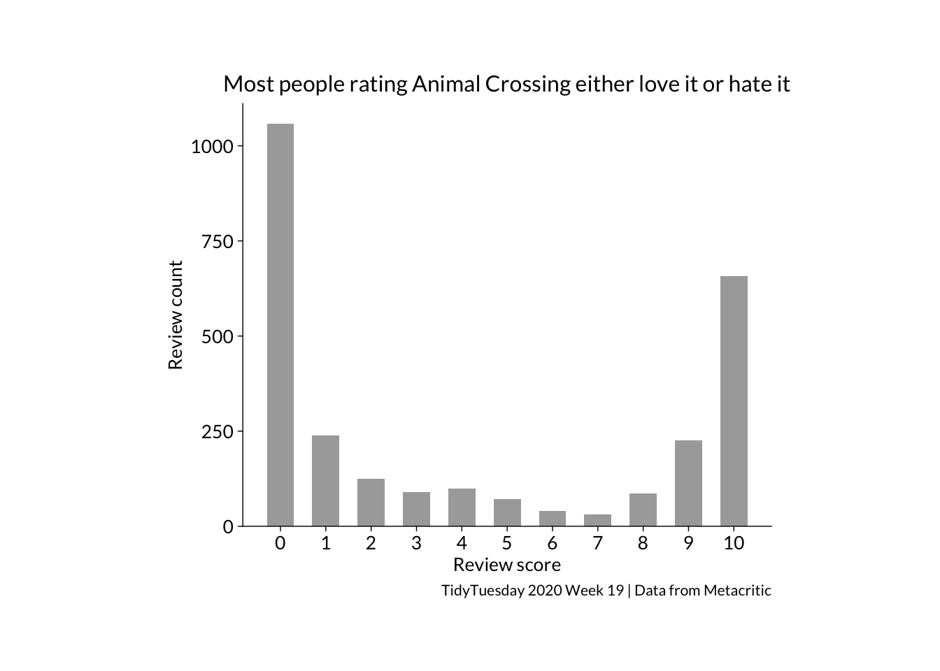
count <- join %>%tabyl(grade)count %>%ggplot(aes(x = grade, y = n)) +geom_col() +theme_minimal(base_family ="Lato") +scale_x_continuous(breaks =0:10) +labs(y ="Review count", x ="Review score", title ="Most people rating Animal Crossing either love it or hate it", caption ="TidyTuesday 2020 Week 19 | Data from Metacritic") +geom_text(aes(label = scales::percent(percent, accuracy =1),vjust =ifelse(percent <0.02, -0.5, 1.5) ),colour =ifelse(count$percent <0.02, "black", "white"),size =3)
Code
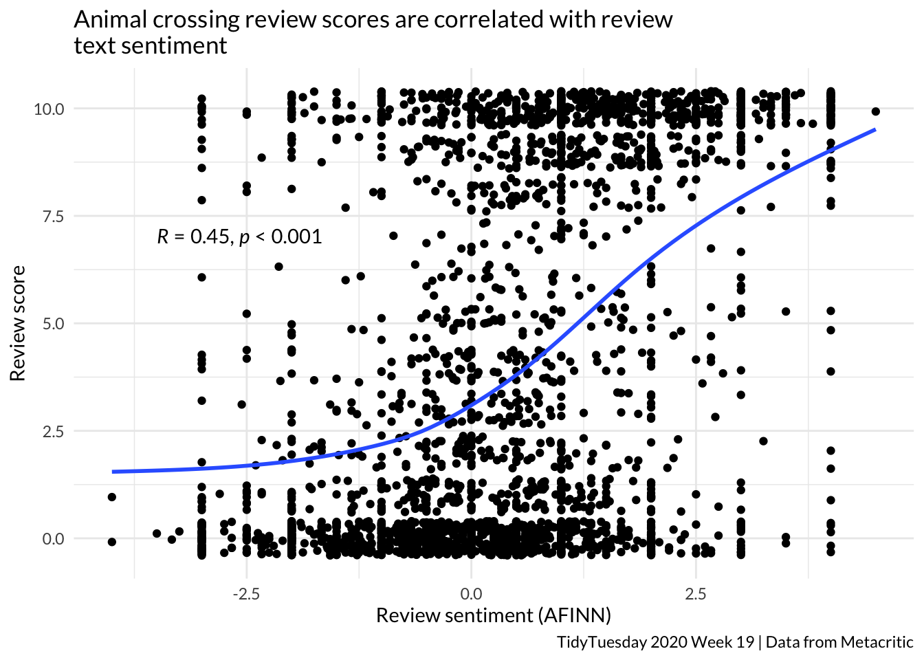
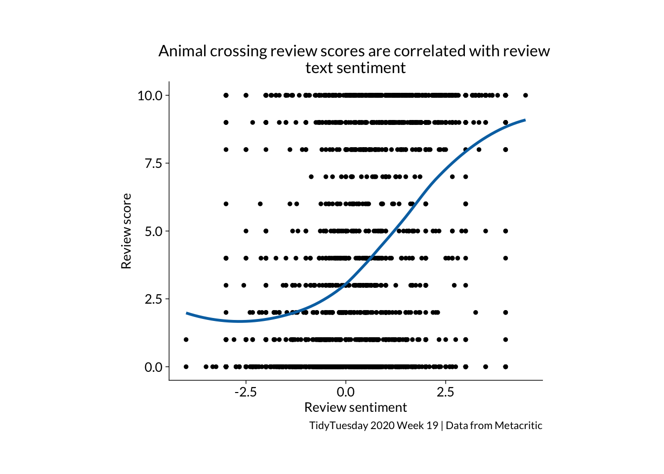
join %>%ggplot(aes(x = sentiment, y = grade)) +geom_jitter() +geom_smooth(se =FALSE) +theme_minimal(base_family ="Lato") +labs(y ="Review score", x ="Review sentiment (AFINN)", title ="Animal crossing review scores are correlated with review \ntext sentiment", caption ="TidyTuesday 2020 Week 19 | Data from Metacritic") +stat_cor(method ="pearson", p.accuracy =0.001, r.accuracy =0.01, label.x =-3.5, label.y =7)
tidyplot
Things I learned about tidyplots…
You create count, sum and mean bar plots from the raw data, rather than summarising first and then making a plot out of a summary table
It is hard to work out how to spread the jitter points, width and height don’t seem to do anything
Code
join %>%tidyplot(x = grade) %>%add_count_bar(fill ="darkgrey") %>%adjust_size(width =100, height =80) %>%adjust_x_axis(breaks =seq(0,10, 1)) %>%adjust_font(family ="Lato", fontsize =10) %>%adjust_x_axis_title("Review score") %>%adjust_y_axis_title("Review count") %>%adjust_title("Most people rating Animal Crossing either love it or hate it", fontsize =12) %>%adjust_caption("TidyTuesday 2020 Week 19 | Data from Metacritic") %>%save_plot(here::here("charts26", "2026-04-15_correlation","tidyfeatured1.png"))
Code
join %>%tidyplot(x = sentiment, y = grade) %>%add_data_points_jitter(colour ="black") %>%add_curve_fit(se =FALSE, linewidth =1) %>%adjust_size(width =100, height =80) %>%adjust_font(family ="Lato", fontsize =10) %>%adjust_x_axis_title("Review sentiment (AFINN)") %>%adjust_y_axis_title("Review score") %>%adjust_title("Animal crossing review scores are correlated with review \ntext sentiment", fontsize =12) %>%adjust_caption("TidyTuesday 2020 Week 19 | Data from Metacritic") %>%save_plot(here::here("charts26", "2026-04-15_correlation","tidyfeatured2.png"))