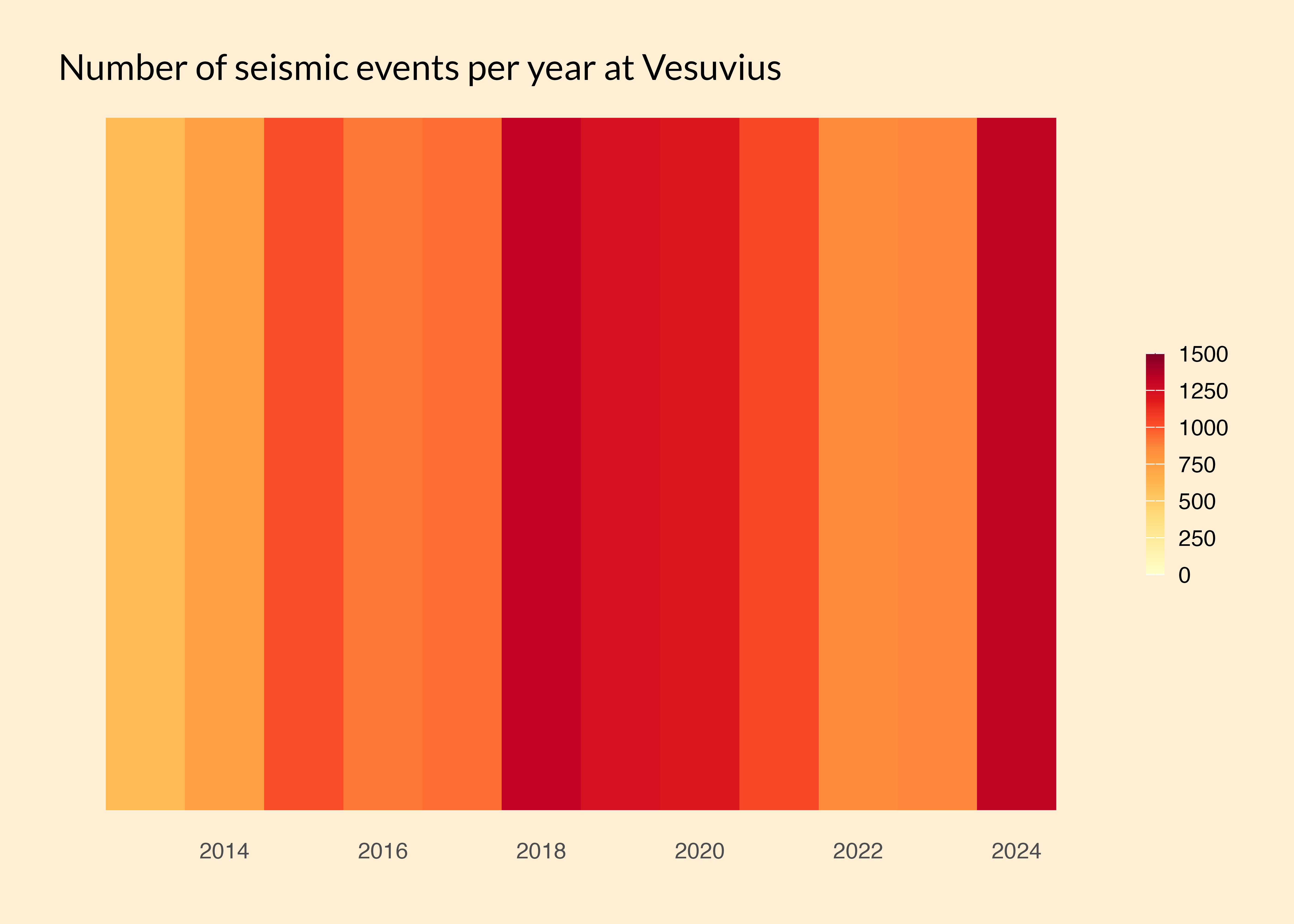
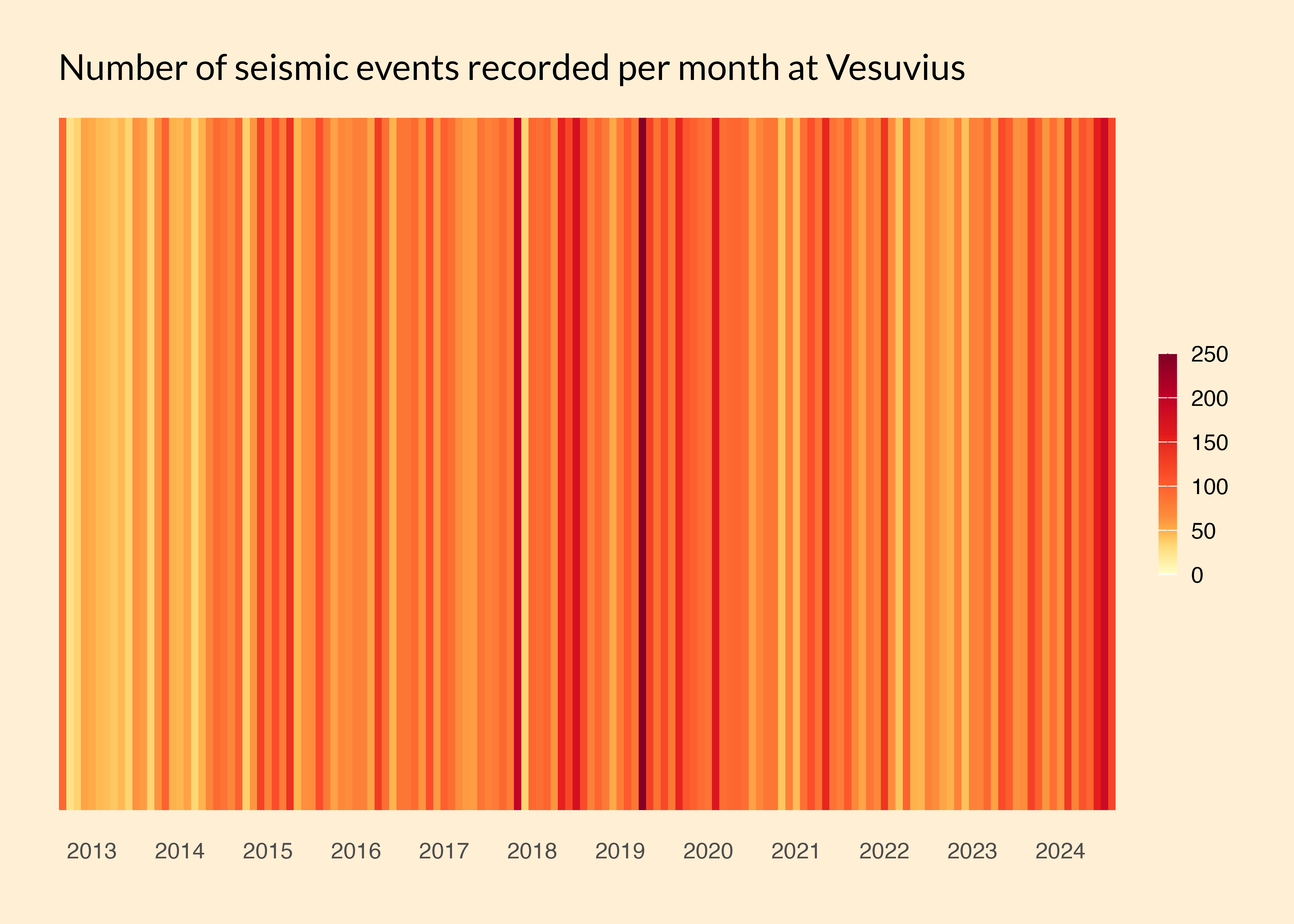
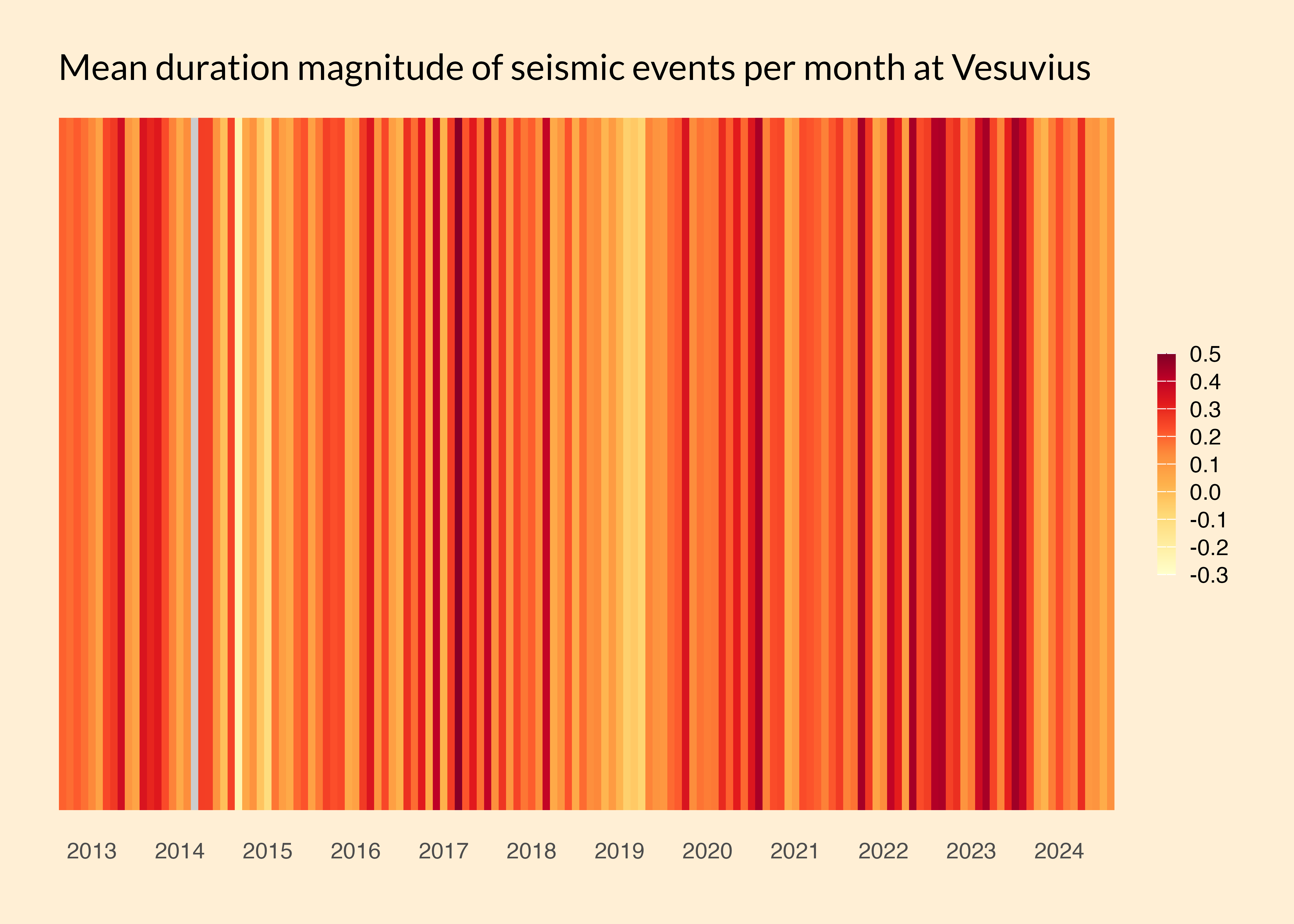
vesuvius

Author

Jen Richmond

Published

May 13, 2025

The TidyTuesday dataset this week is about seismic activity at Mt Vesuvius. Given we are talking about a volcano, I am expecting that there might be cyclical patterns in this data i.e. the volcano is active for a few months and then quietens down and then is active again.

Mt Vesuvius (image source: Wikipedia)

During the #30DayChart challenge I learned how to use geom_tile() to make a “show us your stripes” plot illustrating climate-related changes in temperature. Here I am testing whether a striped plot might be a good way to capture changes in seismic activity over time.

read the data

Code
library(tidyverse)
library(here)
library(janitor)
library(RColorBrewer)
library(ggeasy)
library(patchwork)
library(ggpubr)
library(ggtext)

options(scipen = 999)

tuesdata <- tidytuesdayR::tt_load(2025, week = 19)

v <- tuesdata$vesuvius

v <- v %>%
  mutate(month = month(time, label = TRUE))

glimpse(v)
Rows: 12,027
Columns: 12
$ event_id              <dbl> 4251, 4252, 22547, 22546, 22545, 22544, 22543, 2…
$ time                  <dttm> 2011-04-20 00:27:24, 2012-06-19 21:29:48, 2013-…
$ latitude              <dbl> 40.81800, 40.80883, 40.82217, NA, NA, NA, NA, NA…
$ longitude             <dbl> 14.43000, 14.42717, 14.42800, NA, NA, NA, NA, NA…
$ depth_km              <dbl> 0.42, 1.31, 0.06, NA, NA, NA, NA, NA, NA, NA, NA…
$ duration_magnitude_md <dbl> 1.2, 0.7, 2.2, 0.2, 0.2, 0.0, 0.8, 1.4, -0.2, 0.…
$ md_error              <dbl> 0.3, 0.3, 0.3, 0.3, 0.3, 0.3, 0.3, 0.3, 0.3, 0.3…
$ area                  <chr> "Mount Vesuvius", "Mount Vesuvius", "Mount Vesuv…
$ type                  <chr> "earthquake", "earthquake", "earthquake", "earth…
$ review_level          <chr> "revised", "revised", "preliminary", "preliminar…
$ year                  <dbl> 2011, 2012, 2013, 2013, 2013, 2013, 2013, 2013, …
$ month                 <ord> Apr, Jun, Jan, Jan, Jan, Jan, Jan, Jan, Jan, Jan…

create stripe theme

This theme is adapted from Dominic Roye’s blog. It uses theme_minimal as a base and then gets rid of the y axis axis and labels, gridlines, legend title, adds some space to the x axis labels, makes the legend slightly narrower than default, adds a coloured background, more space around the plot and changes the titlefont.

Code
theme_stripe <- function() { 
  
  theme_minimal() %+replace%
    theme(
      axis.text.y = element_blank(),
      axis.line.y = element_blank(),
      axis.title = element_blank(),
      panel.grid.major = element_blank(),
      legend.title = element_blank(),
      axis.text.x = element_text(vjust = 3),
      panel.grid.minor = element_blank(),
      legend.key.width = unit(0.5, "lines"), 
      panel.background = element_rect(fill = "papayawhip", color = NA),
      plot.background = element_rect(fill = "papayawhip", color = NA),
      plot.margin = margin(t = 20, r = 20, b = 20, l = 20, unit = "pt"), 
      plot.title = element_text(
       family = "Lato",
        size = 14,
        hjust = 0, 
        color = "black"
      )
    )
}

# specific theme for patchwork plot, less white space

theme_stripe_pw <- function() { 
  
  theme_minimal() %+replace%
    theme(
      axis.text.y = element_blank(),
      axis.line.y = element_blank(),
      axis.title = element_blank(),
      panel.grid.major = element_blank(),
      legend.title = element_blank(),
      panel.grid.minor = element_blank(),
      legend.key.width = unit(0.5, "lines"), 
      panel.background = element_rect(fill = "papayawhip", color = NA),
      plot.background = element_rect(fill = "papayawhip", color = NA),
      plot.margin = margin(t = 20, r = 10, b = 10, l = 10, unit = "pt"), 
      plot.title = element_text(family = "Lato", size = 16,hjust = 0, color = "black"), 
      plot.subtitle = element_text(size = 14),
    axis.text.x = element_text(vjust = 3, size = 16),
    legend.text = element_text(size = 14),
    plot.caption = element_text(size = 12)
    )
}


col_stripe <- brewer.pal(9, "YlOrRd")

how many seismic events are recorded at Mt Vesuvius?

per year

Lets start by counting how many seismic events happen at Vesuvius each year. Most of the data was measured between 2013 and 2024, but there were a couple of events relating to 2011/2012 readings, so I am filtering those out.

Code
# count events per year
events_year <- v %>%
  group_by(year) %>%
  summarise(count = n()) %>%
  filter(year >=2013)

# get mean and range for use in gradient

year_maxmin <- range(events_year$count, na.rm = T)
year_md <- mean(events_year$count, na.rm = T)

# plot 
events_year %>%
    ggplot(aes(x = year, y = 1, fill = count)) +
  geom_tile() +
  scale_x_continuous(breaks = seq(2014, 2024, 2)) +
  scale_fill_gradientn(colors = col_stripe, 
                       values = scales::rescale(c(year_maxmin[1], year_md, year_maxmin[2])), 
                       na.value = "gray80", 
                         breaks = seq(0, 1500, 250),
                      limits = c(0, 1500)) + 
  theme_stripe()  +
  labs(title = "Number of seismic events per year at Vesuvius")

Yikes! Looks like 2024 was a particularly active year for Vesuvius, with 1315 events recorded.

per month

What would that look like if we counted the number of events per month and plotted that as a stripe plot? This code is exactly the same as above, except I am grouping by both year and month because summarising the number of events.

Code
events_month <- v %>%
  group_by(year, month) %>%
  summarise(count = n()) %>%
  unite(year_month, c(year, month), sep = "_", remove = FALSE) %>%
  arrange(year, month) %>%
  filter(year >= 2013) %>%
  ungroup()


month_maxmin <- range(events_month$count, na.rm = T)
month_md <- mean(events_month$count, na.rm = T)

jan_each_year <- events_month %>% 
              filter(str_detect(year_month, "_Jan$")) %>% 
              pull(year_month)

just_year <- events_month %>% 
              filter(str_detect(year_month, "_Jan$")) %>% 
              pull(year_month) %>% 
              str_sub(1, 4)


events_month %>%
    ggplot(aes(x = year_month, y = 1, fill = count)) +
  geom_tile() +
  scale_fill_gradientn(colors = col_stripe, 
                       values = scales::rescale(c(month_maxmin[1], month_md, month_maxmin[2])), 
                       na.value = "gray80", 
                        breaks = seq(0, 250, 50),
                      limits = c(0, 250)) + 
  scale_x_discrete(breaks = jan_each_year, labels = just_year) +
  theme_stripe() +
  labs(title = "Number of seismic events recorded per month at Vesuvius")

Plotted by month, 2024 still looks like it had quite high activity, but not as high as periods in 2018 and 2019. In March 2019, there were 247 events recorded.

how big are the seismic events at Mt Vesuvius?

The duration_magnitude_md variable in the vesuvius dataset captures the duration magnitude (Md) of each event, which is an index of the amount of energy released. Here I am grouping by year and month before summarising the mean duration magnitude values per month.

Code
mag_month <- v %>%
  group_by(year, month) %>%
  summarise(mean = mean(duration_magnitude_md, na.rm = TRUE)) %>%
  unite(year_month, c(year, month), sep = "_", remove = FALSE) %>%
  arrange(year, month) %>%
  filter(year >= 2013) %>%
  ungroup()


mag_maxmin <- range(mag_month$mean, na.rm = T)
mag_md <- mean(mag_month$mean, na.rm = T)

mag_month %>%
    ggplot(aes(x = year_month, y = 1, fill = mean)) +
  geom_tile() +
  scale_fill_gradientn(colors = col_stripe, 
                       values = scales::rescale(c(mag_maxmin[1], mag_md, mag_maxmin[2])), 
                       na.value = "gray80", 
                        breaks = seq(-0.3, 0.5, 0.1),
                      limits = c(-0.3, 0.5), 
                      labels = scales::label_number(accuracy = 0.1)) +
  theme_stripe() +
  labs(title = "Mean duration magnitude of seismic events per month at Vesuvius") +
    scale_x_discrete(breaks = jan_each_year, labels = just_year)