Code
library(tidyverse)
library(tidytuesdayR)
library(janitor)
library(ggeasy)
library(ggtext)

# adjust year/week values here
year = 2025
week = 23tidy tuesday week 23
The Tidy Tuesday data today comes from the historydata R package. The today is about US judges. I am particularly interested in the US Supreme Court and how long justices have remained in the role across history.
library(tidyverse)
library(tidytuesdayR)
library(janitor)
library(ggeasy)
library(ggtext)
# adjust year/week values here
year = 2025
week = 23Reading the data and dealing with some date formatting.
tt <- tt_load(year, week)---- Compiling #TidyTuesday Information for 2025-06-10 ----
--- There are 2 files available ---
── Downloading files ───────────────────────────────────────────────────────────
1 of 2: "judges_appointments.csv"
2 of 2: "judges_people.csv"appt <- tt[[1]]
appt <- appt %>%
mutate(across(ends_with("_date"), ~ mdy(.))) %>%
mutate(retirement_from_active_service = mdy(retirement_from_active_service))
people <- tt[[2]]
people <- people %>%
mutate(age_at_death = death_date - birth_date)I start by joining the people and appt dataframes and for ease of use, create some new variables that pull year values out of dates. I filter for just the supreme court and select relevant columns, before sorting out some duplicate name issues.
Did you know that there were two justices named John Harlan? One born in 1833 and his grandson born in 1899.
I create a new variable that codes dates as pre vs post 1900 and a couple that allow me to set the colour of the dot by a different coloured point depending on whether the justice retired or their term ended (because they died).
joined <- left_join(people, appt, by = "judge_id") %>%
  arrange(judge_id) %>%
  mutate(year_confirmed = year(senate_confirmation_date),
         year_retired = year(retirement_from_active_service),
         year_terminated = year(termination_date))

ussc <- joined %>%
  filter(court_type == "USSC") %>%
  filter(!is.na(year_confirmed)) %>%
  select(1:6, 26:31) %>%
  mutate(length_of_term = year_terminated - year_confirmed) %>%
  mutate(last_first = paste0(name_last, ", " , name_first)) %>%
  mutate(last_first = case_when(name_last == "Harlan" & birth_date == "1833" ~ "I Harlan, John",
                                name_last == "Harlan" & birth_date == "1899" ~ "II Harlan, John",
                                TRUE ~ last_first)) %>%
    distinct(last_first, .keep_all = TRUE) %>%
  mutate(period = case_when(year_confirmed < 1900 ~ "pre1900",
                             year_confirmed >= 1900 ~ "post1900",
                            )) %>%
  mutate(endpoint = case_when(!is.na(year_terminated) ~ year_terminated,
                              !is.na(year_retired) ~ year_retired,
                               TRUE ~ NA_real_))  %>%
  mutate(status = case_when(!is.na(year_terminated) ~ "Term end",
                            !is.na(year_retired) ~ "Retired",
                       TRUE ~ "Current"))

# order names by year confirmed
ussc$last_first <- fct_reorder(ussc$last_first, ussc$year_confirmed)

# select just plot variables
ussc_plot <- ussc %>%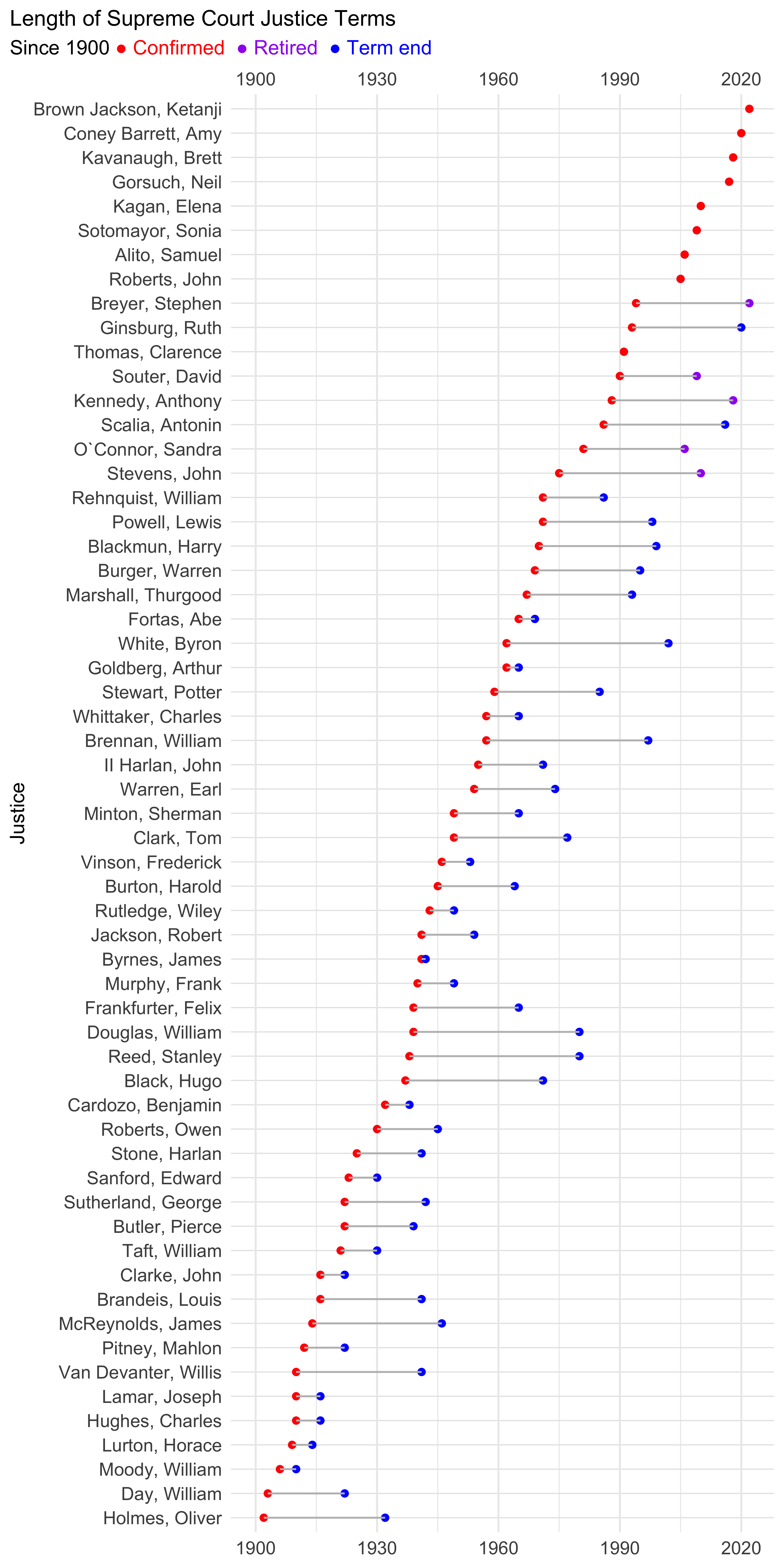
select(period, last_first, year_confirmed, year_retired, year_terminated, endpoint, status)This plot looks ok. It took me ages to work out that the easiest way to make a taller plot that gives each justice more vertical room is to set the r chunk options {r fig.width=6, fig.height=12, fig.dpi=300}.
Unfortunately this data isn’t up to date for the most recent justices. Scalia and Ginsburg have died, Kennedy and Breyer have retired and four new justices have joined the court.
ussc_plot %>%
  filter(period == "post1900") %>%
ggplot() +
  geom_point(aes(x = last_first, y = year_confirmed),
             colour = "red", size = 1.5) +
  geom_point(aes(x = last_first, y = endpoint, colour = status),
             size = 1.5, na.rm = TRUE) +
  geom_segment(aes(x = last_first,
                   xend= last_first,
                   y = year_confirmed, yend = endpoint),
               colour = "grey", na.rm = TRUE) +
 coord_flip() +
   scale_y_continuous(limits = c(1900, 2020), breaks = seq(1900,2020,30)) +
  theme_minimal() +
  labs(y = "Year", x = "Justice",
       title = "Length of Supreme Court Justice Terms",
       subtitle = "Since 1900 <span style='color:red'>● Confirmed</span>
                    <span style='color:purple'>● Retired</span>
                  <span style='color:blue'>● Term end</span>") +
    theme(plot.title.position = "plot",
        plot.subtitle = element_markdown(),
        panel.grid.major.y = element_line(linewidth = 0.3, color = "grey90"),
        panel.grid.minor.y = element_line(linewidth = 0.1, color = "grey95"),
        axis.text.y = element_text(size = 10),
        axis.text.x = element_text(size = 10),
          plot.title = element_text(size = 12)) +
  scale_colour_manual(values = c("Term end" = "blue",
                                 "Retired" = "purple")) +
  easy_remove_legend()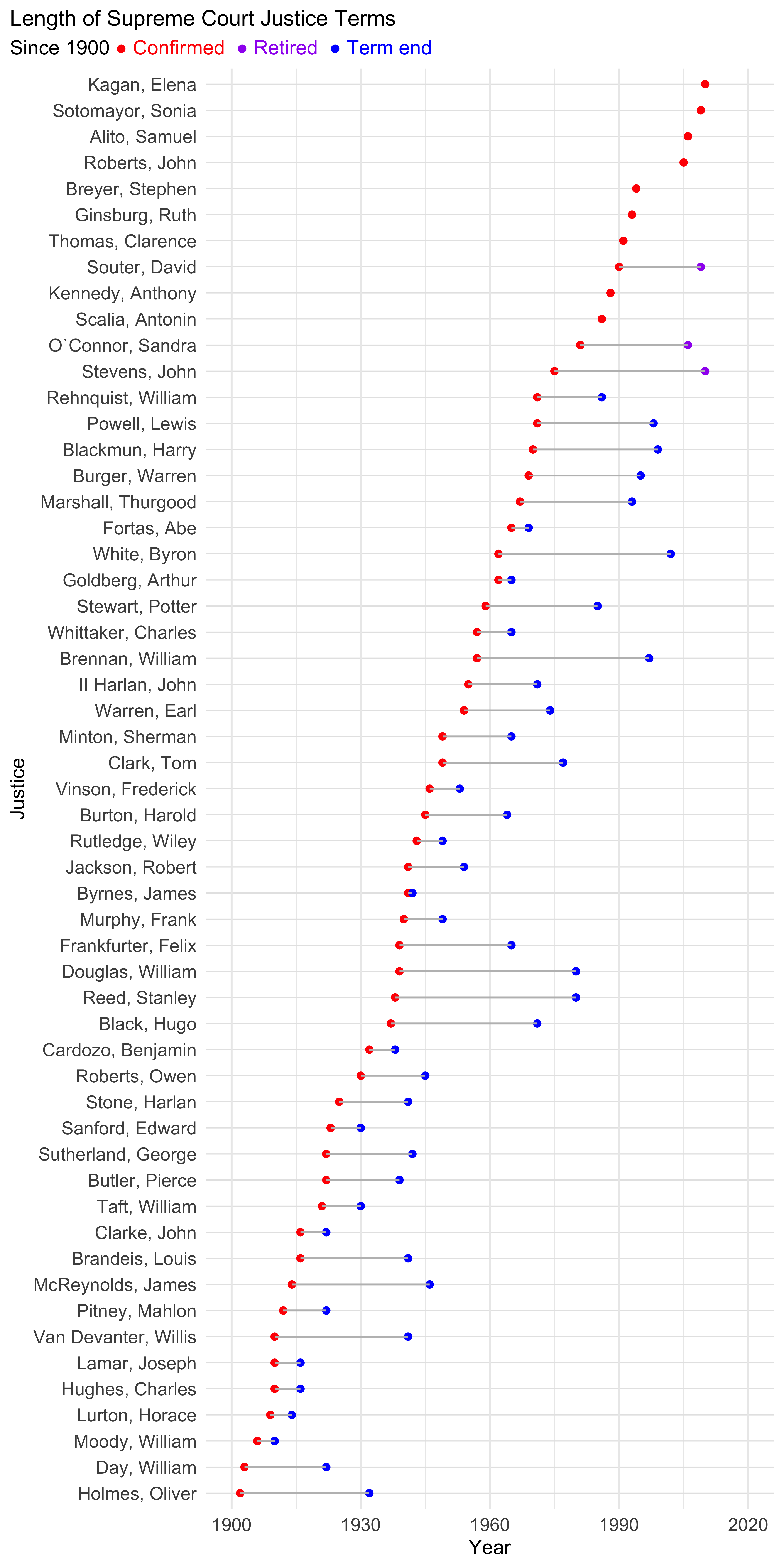
This chunk creates a new dataframe for the four most recent justices and updates values for those that have died and retired.
# get just those appointed since 1980

ussc80 <- ussc_plot %>%
  filter(year_confirmed > 1980) %>%
  arrange(year_confirmed)

# make new df with most recent 4 appointees

new_justice <- tibble(
  period = c("post1900", "post1900","post1900","post1900"),
  last_first = c("Gorsuch, Neil", "Kavanaugh, Brett", "Coney Barrett, Amy", "Brown Jackson, Ketanji"),
  year_confirmed = c(2017, 2018, 2020, 2022),
  year_retired = c(NA, NA, NA, NA),
  year_terminated = c(NA, NA, NA, NA),
  endpoint = c(NA, NA, NA, NA),
  status = c("Current", "Current","Current","Current")
)

# join since 1980 and new justices, correcting values for those no longer serving

ussc_recent <- rbind(ussc80, new_justice) %>%
  mutate(
    year_retired = replace(year_retired, last_first == "Kennedy, Anthony", 2018),
    year_retired = replace(year_retired, last_first == "Breyer, Stephen", 2022),
    year_terminated = replace(year_terminated, last_first == "Scalia, Antonin", 2016),
    year_terminated = replace(year_terminated, last_first == "Ginsburg, Ruth", 2020)) %>%
  mutate(endpoint = case_when(!is.na(year_terminated) ~ year_terminated,
                              !is.na(year_retired) ~ year_retired,
                               TRUE ~ NA_real_))  %>%
mutate(status = case_when(!is.na(year_terminated) ~ "Term end",
                            !is.na(year_retired) ~ "Retired",
                       TRUE ~ "Current"))

# bind updated ussc data with old df, keeping only distinct names.

updated_ussc <- rbind(ussc_recent, ussc_plot) %>%
  distinct(last_first, .keep_all = TRUE) %>%
  mutate(term_length = case_when(year_terminated - year_confirmed > 30 ~ "long",
                                 year_terminated - year_confirmed <= 30 ~ "short",
))updated_ussc %>%
filter(period == "post1900") %>%
ggplot() +
geom_point(aes(x = last_first, y = year_confirmed),
colour = "red", size = 1.5) +
geom_point(aes(x = last_first, y = endpoint, colour = status),
size = 1.5, na.rm = TRUE) +
geom_segment(aes(x = last_first,
xend= last_first,
y = year_confirmed, yend = endpoint), colour = "grey",
na.rm = TRUE) +
coord_flip() +
scale_y_continuous(limits = c(1900, 2022), breaks = seq(1900,2020,30),
sec.axis= dup_axis()) +
theme_minimal() +
labs(y = "Year", x = "Justice",
title = "Length of Supreme Court Justice Terms",
subtitle = "Since 1900 <span style='color:red'>● Confirmed</span>
<span style='color:purple'>● Retired</span>
<span style='color:blue'>● Term end</span>") +
theme(plot.title.position = "plot",
plot.subtitle = element_markdown(),
panel.grid.major.y = element_line(linewidth = 0.3, color = "grey90"),
panel.grid.minor.y = element_line(linewidth = 0.1, color = "grey95"),
axis.text.y = element_text(size = 10),
axis.text.x = element_text(size = 10),
plot.title = element_text(size = 12)) +
scale_colour_manual(values = c("Term end" = "blue",
"Retired" = "purple")) +
easy_remove_legend() +
easy_remove_x_axis(what = c("title"))