Code
library(tidyverse)
library(tidytuesdayR)
library(ggeasy)
library(ggannotate)

tuesdata <- tidytuesdayR::tt_load(2025, week = 44)

flint_mdeq <- tuesdata[[1]]
flint_vt <- tuesdata[[2]]

rm(tuesdata)Tidy Tuesday Week 44
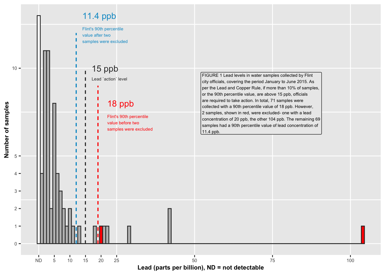
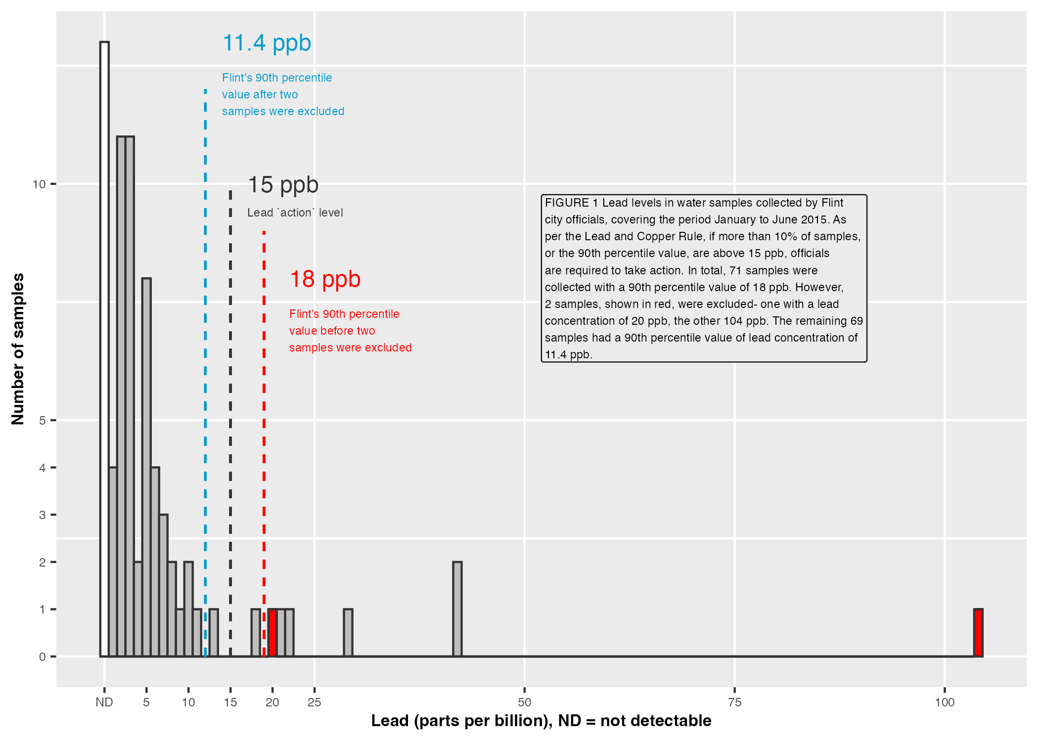
The TidyTuesday data this week is from a paper by Loux & Gibson (2018) about using lead data from Flint Michigan as a example for introductory statistics. When I was curating the data, I wanted to use the figure from this blog post about the murky tale of Flint’s water data, but the image wouldn’t download well, so here is how I recreated it using ggplot.
library(tidyverse)
library(tidytuesdayR)
library(ggeasy)
library(ggannotate)
tuesdata <- tidytuesdayR::tt_load(2025, week = 44)
flint_mdeq <- tuesdata[[1]]
flint_vt <- tuesdata[[2]]
rm(tuesdata) flint_mdeq %>%
summarise(
p90lead = quantile(lead, 0.90),
p90lead2 = quantile(lead2, 0.90, na.rm= TRUE)) %>%
gt::gt()| p90lead | p90lead2 |
|---|---|
| 18 | 11.4 |
The plot colours samples that were removed red and those where lead was non detectable (i.e. 0) white. In order to fill the histogram bars in this way, here I am creating a new variable which categorises each sample as removed, kept or ND.
  flint_mdeq <- flint_mdeq %>%
    mutate(removed = case_when(lead == 104 & is.na(lead2) ~ "remove",
                             lead == 20 & is.na(lead2) ~ "remove",
                             lead == 0 ~ "ND",
                             TRUE ~ "keep"  # keeps existing values for other rows
)) pal <- c("grey", "white", "red")
flint_mdeq %>%
ggplot(aes(x = lead, fill = removed)) +
geom_vline(xintercept = seq(0, 100, by = 25),
colour = "white",
linewidth = 0.5) +
geom_hline(yintercept = seq(0, 12.5, by = 2.5), # Adjust the range and interval as needed
colour = "white",
linewidth = 0.5) +
geom_histogram(binwidth = 1, colour = "grey20") +
labs(y = "Number of samples",
x = "Lead (parts per billion), ND = not detectable") +
scale_x_continuous(
breaks = c(0, 5, 10, 15, 20, 25, 50, 75, 100),
labels = c("ND", "5", "10", "15", "20", "25", "50", "75", "100")) +
scale_y_continuous(
breaks = c(0, 1, 2, 3, 4, 5, 10)) +
scale_fill_manual(values = pal) +
easy_remove_gridlines() +
easy_remove_legend() +
geom_segment(aes(x = 12, xend = 12, y = 0, yend = 12),
colour = "deepskyblue3",
linetype = "dashed") +
geom_text(data = data.frame(x = 14, y = 13, label = "11.4 ppb"),
mapping = aes(x = x, y = y, label = label),
size = 4, hjust = 0, colour = "deepskyblue3",, family = "", inherit.aes = FALSE) +
geom_text(data = data.frame(x = 14, y = 11.9, label = "Flint's 90th percentile \nvalue after two \nsamples were excluded"),
mapping = aes(x = x, y = y, label = label),
size = 2, hjust = 0, colour = "deepskyblue3", family = "", inherit.aes = FALSE) +
geom_segment(aes(x = 15, xend = 15, y = 0, yend = 10),
colour = "grey20",
linetype = "dashed") +
geom_text(data = data.frame(x = 17, y = 10, label = "15 ppb"),
mapping = aes(x = x, y = y, label = label),
size = 4, hjust = 0, colour = "grey20", family = "", inherit.aes = FALSE) +
geom_text(data = data.frame(x = 17, y = 9.4, label = "Lead `action` level"),
mapping = aes(x = x, y = y, label = label),
size = 2, hjust = 0, colour = "grey20", family = "", inherit.aes = FALSE) +
geom_segment(aes(x = 19, xend = 19, y = 0, yend = 9),
colour = "red",
linetype = "dashed") +
geom_text(data = data.frame(x = 22, y = 8, label = "18 ppb"),
mapping = aes(x = x, y = y, label = label),
size = 4, hjust = 0, colour = "red", family = "", inherit.aes = FALSE) +
geom_text(data = data.frame(x = 22, y = 6.9, label = "Flint's 90th percentile \nvalue before two \nsamples were excluded"),
mapping = aes(x = x, y = y, label = label),
size = 2, hjust = 0, colour = "red", family = "", inherit.aes = FALSE) +
theme(axis.text.x = element_text(size = 6),
axis.text.y = element_text(size = 6),
axis.title.x = element_text(size = 8, face = "bold"),
axis.title.y = element_text(size = 8, face = "bold")) +
geom_label(data = data.frame(x = 52, y = 8,
label = str_wrap("FIGURE 1 Lead levels in water samples collected by Flint city officials, covering the period January to June 2015. As per the Lead and Copper Rule, if more than 10% of samples, or the 90th percentile value, are above 15 ppb, officials are required to take action. In total, 71 samples were collected with a 90th percentile value of 18 ppb. However, 2 samples, shown in red, were excluded- one with a lead concentration of 20 ppb, the other 104 ppb. The remaining 69 samples had a 90th percentile value of lead concentration of 11.4 ppb.",
width = 60)),
mapping = aes(x = x, y = y, label = label),
size = 2, fill = "grey92", hjust = 0, family = "", inherit.aes = FALSE)