Code
library(tidyverse)
library(tidytuesdayR)
library(janitor)
library(ggeasy)

df <- tt_load("2026-02-17")

df <- df[[1]]

options(scipen= 999)The TidyTuesday data this week comes from NZ agriculture production statistics. I was interested to dig into the relative change in sheep vs dairy numbers, and learn about what has happened to kiwifruit vs. wine production.
library(tidyverse)
library(tidytuesdayR)
library(janitor)
library(ggeasy)
df <- tt_load("2026-02-17")
df <- df[[1]]
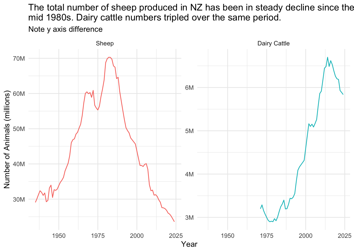
options(scipen= 999)df %>%
filter(measure %in% c("Total Sheep", "Total Dairy Cattle (including Bobby Calves)")) %>%
mutate(measure = factor(measure, levels = c(
"Total Sheep",
"Total Dairy Cattle (including Bobby Calves)"
))) %>%
ggplot(aes(x = year_ended_june, y = value, colour = measure)) +
geom_line() +
facet_wrap(~measure,
scales = "free_y",
labeller = as_labeller(c(
"Total Dairy Cattle (including Bobby Calves)" = "Dairy Cattle",
"Total Sheep" = "Sheep"
))
) +
theme_minimal() +
easy_remove_legend() +
labs(y = "Number of Animals (millions)", x = "Year",
title = "The total number of sheep produced in NZ has been in steady decline since the \nmid 1980s. Dairy cattle numbers tripled over the same period.",
subtitle = "Note y axis difference") +
scale_y_continuous(
labels = scales::label_number(scale = 1e-6, suffix = "M"),
breaks = scales::breaks_pretty(n = 4)
)
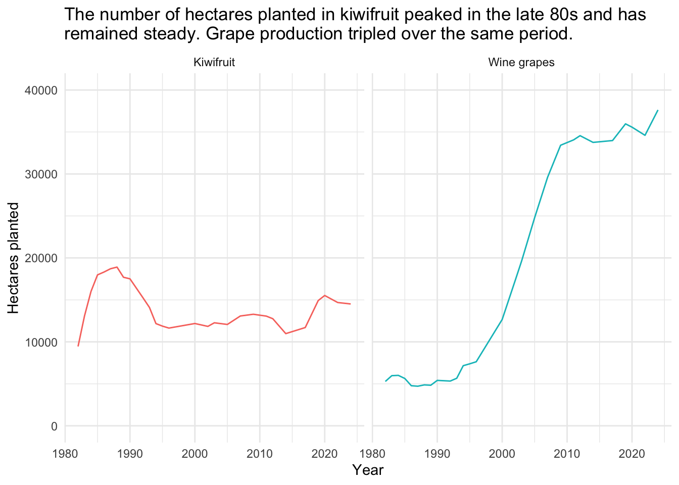
df %>%
  filter(measure %in% c("Wine grapes", "Kiwifruit")) %>%
  ggplot(aes(x = year_ended_june, y = value, colour = measure)) +
  geom_line() +
  facet_wrap(~measure) +
    theme_minimal() +
  easy_remove_legend() +
  labs(y = "Hectares planted", x = "Year",
       title = "The number of hectares planted in kiwifruit peaked in the late 80s and has \nremained steady. Grape production tripled over the same period.") +
  scale_y_continuous(limits = c(0,40000)
  )